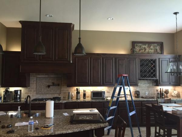
In response to this post and this one too, I keep getting questions in my inbox and here on DESIGNED from people wanting advice about decorating above the cabinets.
While I do sell this type of advice you'll soon receive here for free, I decided to go ahead and address this hot topic in the same format my DESIGNED In A Click! service uses so you can experience what you'll receive should you decide to reach out to me for a little bit of help. ;-)
RELATED: I’ve done one other advice post that unfolds in a way that's similar to my DESIGNED In A Click! service. It's also about decorating above the cabinets, and you can check it out HERE.
Oh, and before you scroll any further, I can't help but say...
My Google Drawing skills are very mediocre. (Haha ;-) My staff does some amazing drawings on CAD and creates beautiful digital storyboards for our clients in Publisher and Photoshop; but I, on the other hand, am in charge of the bigger picture and don’t spend much time doing drawings (except by hand). I did, however, enjoy playing around in Google Drive with these, so well, please excuse my rudimentary skills here, please. :-)
READER MAIL
RE: DECORATING ABOVE YOUR CABINETS
READER Question #1:
"Hi. I guess this article is kind of old, but just came across is while trying to decorate our new home. We have a lot of space above our cabinets that I want to do something with, but in the past have always used fake greenery. It does feel dated and I don't want to use it again, but am struggling with what to do. We have one end of the cabinets that is like a butlers pantry/wine rack, and I was thinking of doing that section with wine theme and the rest of the tops of the cabinets different, but they are connected so not sure what to do. Help! ~Beth"
My Response:
First of all... Most everything I publish — aside from “trends” — is evergreen. Good design is good design is good design, no matter what the age. While technology, building materials, furniture, and building styles might change, most of what I discuss here on DESIGNED applies basic principles of design to different situations, and the advice I provide is always rooted in good principles and will, undoubtedly, stand the test of time.
Regarding your situation: I’ve placed a diagram over your image so you can see what I recommend. The principle applied here is balance — we’re creating balance by building up that area on the right side with bulky objects. Take a look:
I’ve also included an option for this space, because it's long and the hood is dominant:
Question #2:
"Hi, Carla! I have great vaulted ceilings in my kitchen and feel like I need something on my cabinets. I have no idea though what. I was thinking maybe big Marquis words or maybe get an appliqué for the wall, like a cute saying that I could start on one wall and then have it go onto the other wall? I don't have a collection of anything to put up there."
My Response:
Please... No "cute sayings". Just the other day I was perusing a Facebook group where designers were complaining about those. :-) Don't get me wrong — it's not that something beautifully written, with equally beautiful meaning, represents bad design, it's just that these can get a bit overused, causing them to look cheap, fast.
Instead, I’d work on building a collection of items of similar color and texture, in shapes that I’ve shown in the diagram below. Second hand stores, flea markets, and antique markets — like Round Top, that I go to every year — all have tons of items that aren’t expensive. Baskets can be quite inexpensive too — especially from IKEA or Target.
When you build a mass from several objects, making them as similar as possible in color, texture, and type, it helps to create an overall look, as opposed to a chopped up, spotty, cluttered visual.
Further explanation is available in this diagram:
Question #3:
"I just recently moved into a new house and am not sure what to do to decorate over the top of my kitchen cabinets since it's a ton of space over the left side of the cabinets and hardly none over the right. Any helpful tips/ideas would be much appreciated!! Thanks"
My Response:
I would build up on the left side to create some variation, like I indicated in the drawing. I also included a few additional tips in the following diagram to help make your kitchen look more custom when you are ready to do something more. Take a look:
In each of the above instances, I think these readers would benefit from some strategic decorating above the cabinets.
We’re trying to create some variation, some interest, and make these spaces look more high-end and custom. With the objects they choose, they would be best if they were larger in size, alike in color and texture, and sort of blend with the cabinetry to help create the look of a varied line of upper cabinets.
I hope this helps! ;-)
I want to thank my readers for submitting their questions. If you want some quick advice on decorating above your cabinets, or anything else for that matter, you can find out more about my DESIGNED In A Click! service HERE.
Walang komento:
Mag-post ng isang Komento