Last week all our design plans were due so the committee and homeowners could review them. And I’m happy to say…
They were all approved!
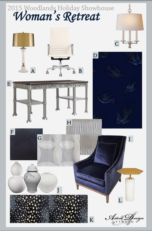
Here’s a peek at my plan and some of the selections I’ve made to fill out the room:
You know, it’s hard to design anything without a goal or a client in mind. That’s why, when I designed my last showhouse room, an upstairs bedroom and bath, I invented “Phoebe”, a teenaged girl who was getting ready to head off to college. This time, for this “woman’s retreat” or home office, I’m dreaming of a more glamorous and charming version of myself — you know, a designer; someone with a lot more money in the bank; someone who’s thin, pretty, and younger too.
Still brunette though.
Because, you see, I’ll be standing in this room...a lot. I’ll be smiling and dishing on the design for all who visit. That’s why this room has to look good on ME. And we’ve already talked about me being a winter and all…so we don’t have to go there again. (But I will say that high contrast and dramatic cool tones were a big part of my design plan because of that very reason. Click here if you don’t know what I’m talking about.)
Here was the concept statement I presented:
“This retreat is designed to be an elegant, rich, glamorous space for a woman who is a serious entrepreneur, a designer, who spends much of her time on-the-go. She comes here to be creative and dream; to pamper herself with a little luxury; to relax in the velvet chair or window seat; to flip through her stacks of design books and magazines for inspiration and respite; to cocoon herself in dark, rich swaths of her favorite navy color highlighted with silver, brass, crystal, and rich wood accents.
She protects her private closet, the one behind her desk, which is full of her “favorites”: baskets and bins of the best fabric, wallcovering, and trim samples to dig through when inspiration hits, because we all know that can occur in the middle of the night, right before bed, or in the early morning before one gets to the office for the day.
This is her favorite room in the house. It’s designed with only her in mind. And the color scheme she used makes a statement of not blending with the house...purposefully.
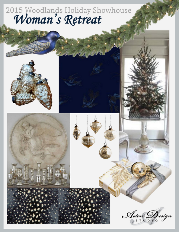
She designs a little tree for herself that’s full of breakable ornaments; it’s out of the way of the kids, the animals, the noise of the house. She loves live greens hanging as a wreath in the window, and with her little tree, so the pungent scent of the woods can be ever present during the holidays.
(Sorry, got a little carried away. :-)”
And here are the design boards we created:

2015 Woodlands Holiday Showhouse - A Woman's Retreat

2015 Woodlands Holiday Showhouse - A Woman's Retreat

Walang komento:
Mag-post ng isang Komento