
Office building elevation | Drawing by interior designer Carla Aston
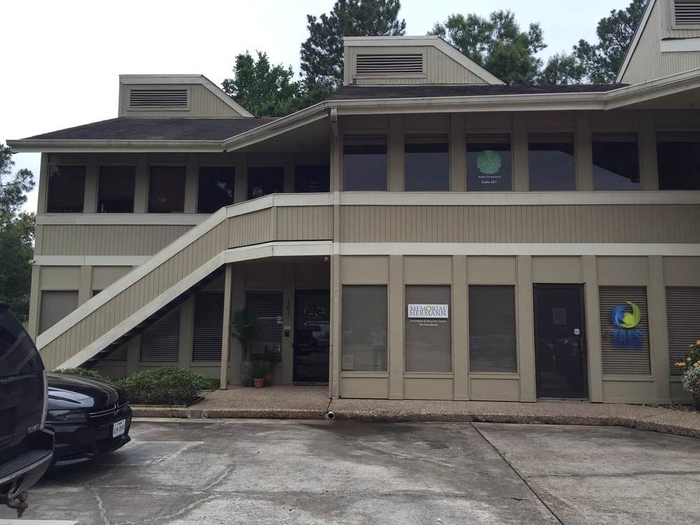
I've just been asked by a client of mine to consult with him on exterior paint colors for a small office building he owns.
It's nestled in a quiet area, actually butts up to a golf course, and has a few other buildings of similar size and design neighboring it in the street. The area is suburban and almost residential in feel.
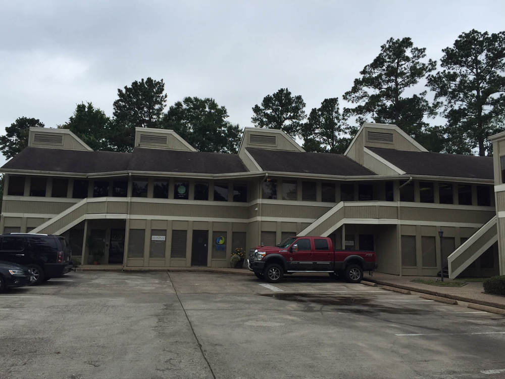
Here's how it looks now:

Here's what has been discussed for the exterior materials and colors:
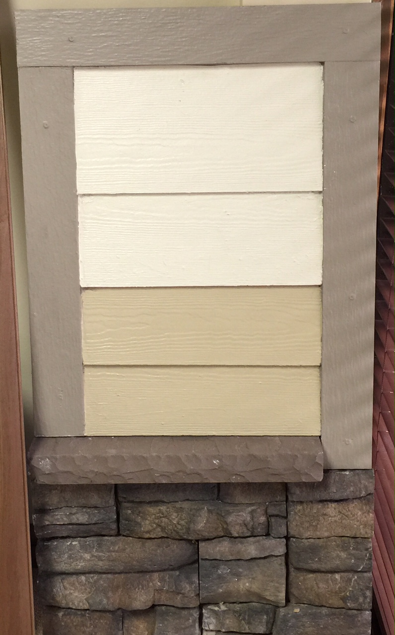
This combination of medium gray/brown stone, with oatmeal and cream cement siding is all over this area.
It's just done and done and done to death here. If I owned this building, I'd do something different. And that's exactly how I'll be advising my client.
I really like the more contemporary lines of this building. I think it can actually be quite striking. I think the materials and color choices should play up on the style of architecture. I think it should stand out from it's neighbors. I think it should look cool and up-to-date.
So, I'm going to recommend something bold.
I'd love to see him paint it all a very dark gray. A modern gray. (I'd say black, but I think people around here would freak out at that. I'm kind of obsessed with black structures.) It needs to be something that won't blend into the woods here. Camouflage is for hunting, not for office buildings. It will create a cleaner overall look and make the building feel grander and more important. The dark gray will be very current and attract people who are wanting a cool place to work.
I'll allow a little light gray contrast on the trim, it might highlight the contemporary lines of the structure. Oh, and I'd do a metal roof in a matte silver color to lighten the look and highlight the angles.
The body of the building should be more striking and austere. There's so much undulation or choppiness in the facade, it steps back at every peak in the roof line, so it needs a unification of one color. It needs to be all tied together with one finish. It does not need a combination of stone and planking, but planking alone, with a few single directional changes done only in selected areas just to make it interesting.
The overall concept would look something like these exteriors:
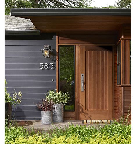
Photo via Rejuvination
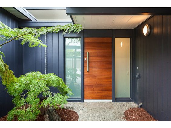
Photo via Redfin
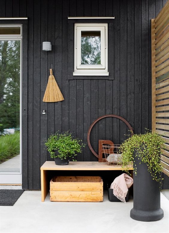
Photo via Husohem
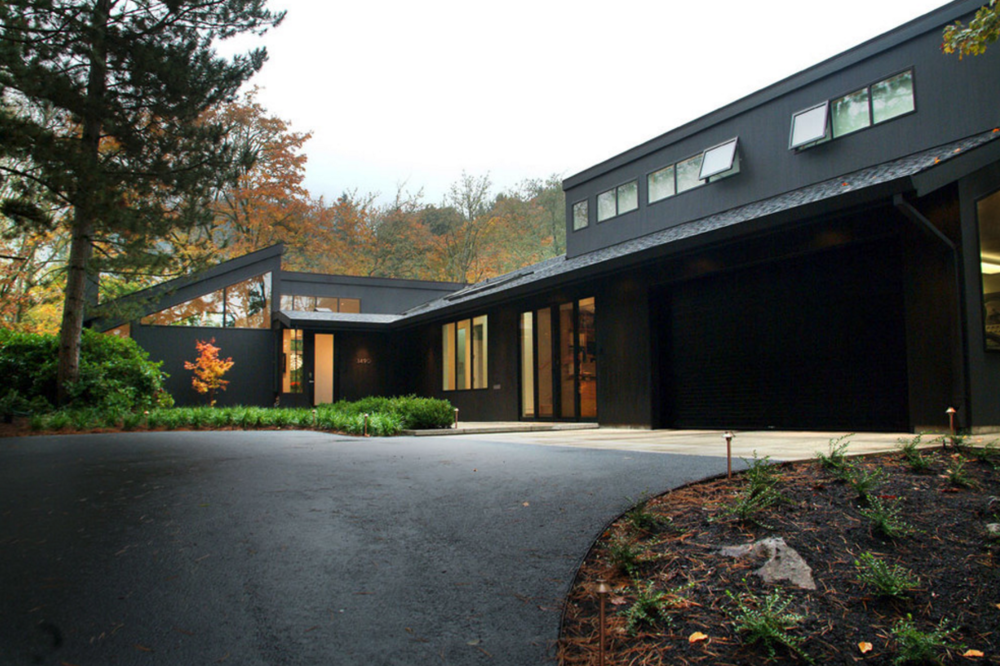
Photo via Giulietti Schouten Architects
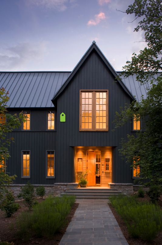
Photo via Carlton Architecture
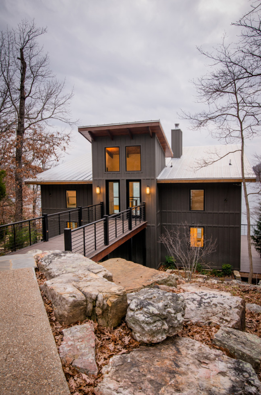
Photo via John M. Holmes Architect
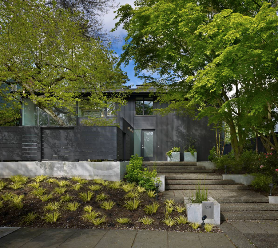
Photo via Lane Williams Architects
They're opening up the interior corridor to the outside front and doing an outdoor decking/balcony, so we'll have a railing across the building in the new, updated version. I really like the idea of a steel wire railing, with a wood cap. I'd love the horizontal lines of the silvery wires to visually cross the verticals of the planking when you look at it from afar. I'd also love the introduction of a bit of warm wood, something like a teak, to warm up the facade and relate it to the nature surrounding it. The wood should be placed where you would naturally touch it, on the handrail, the doors.
The railing could look something like this:

Photo via MTLA- Mark Tessier Landscape Architecture
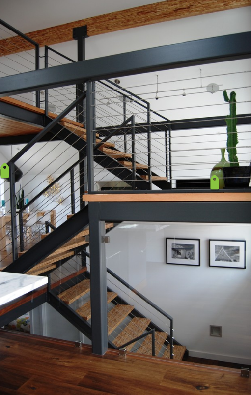
Photo via Portal Design Inc
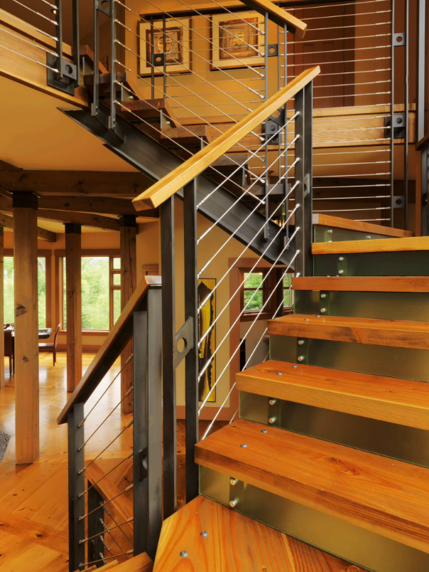
Photo via Cushman Design Group
And the building should look something like this:
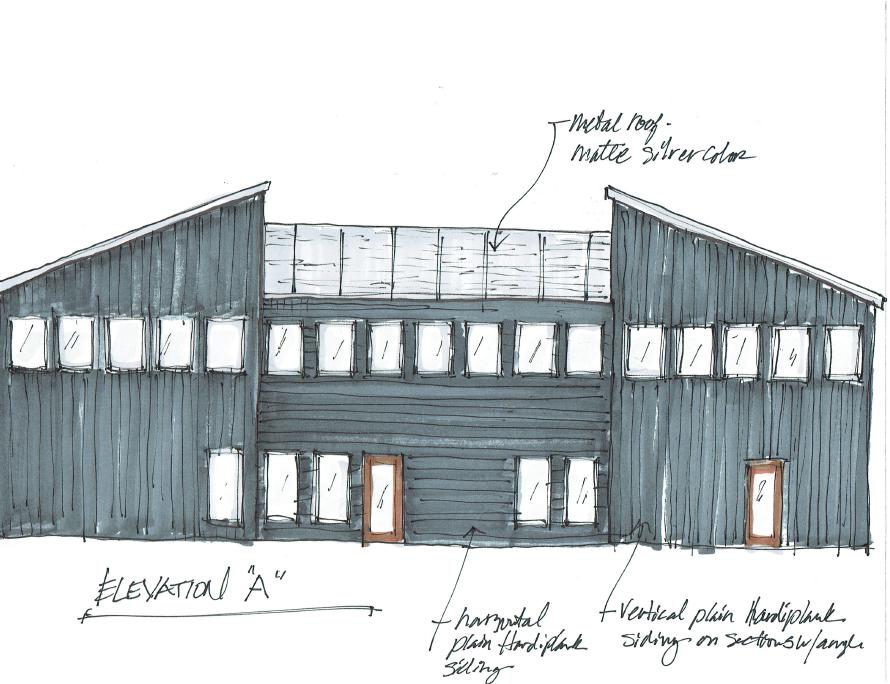
Office building elevation | Drawing by interior designer Carla Aston
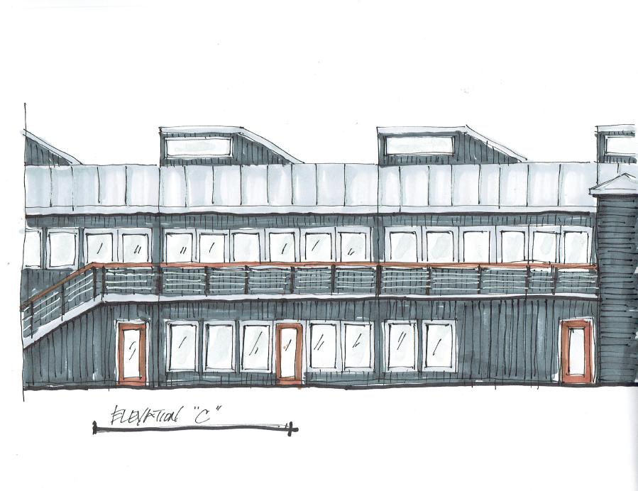
Office building elevation | Drawing by interior designer Carla Aston
I hope he goes for it!

BEFORE & AFTER: A Honey Bee Ham Restaurant Goes From Tired & Dated To Fresh & Delicious!
Design is design is design.
The same basic principles apply in all situations, so crossing over to different types of projects can work just fine.
Want to see another commercial job I did here in The Woodlands?
Then click the Honey Bee Ham image! ;-)
Walang komento:
Mag-post ng isang Komento