
I'm sharing another project reveal today - this time a kitchen remodel that went from dark and brown to light and white!
And we did more than just paint the cabinets!
While we had to mind the budget a bit, as we're doing much more overall in this lovely home, I was so happy this homeowner decided to go as far as they did with their remodel. I always feel that if you go ahead and invest just a bit more you end up being happier in the long run.
They have a beautiful outcome and now I can't wait to share what we did.
This home was dated looking and dark. The island was extra large - so much so that the space between the sink side of the island and the back cabinets was too narrow. It was difficult to get around back there. And when the dishwasher door or any cabinet doors were open, it was totally blocked.
The Befores:
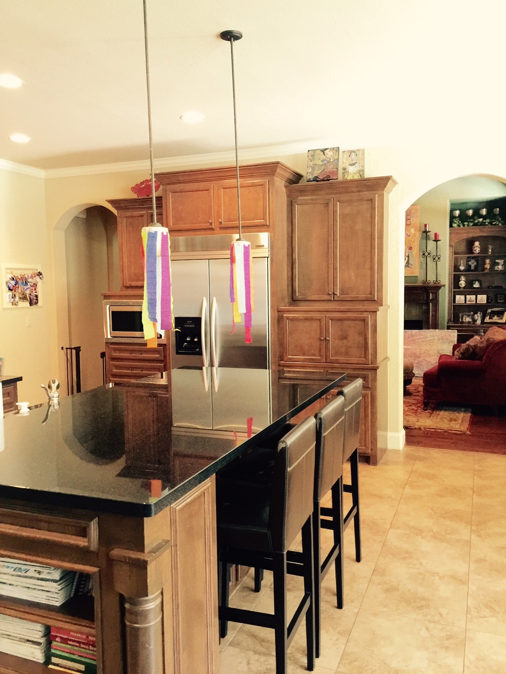
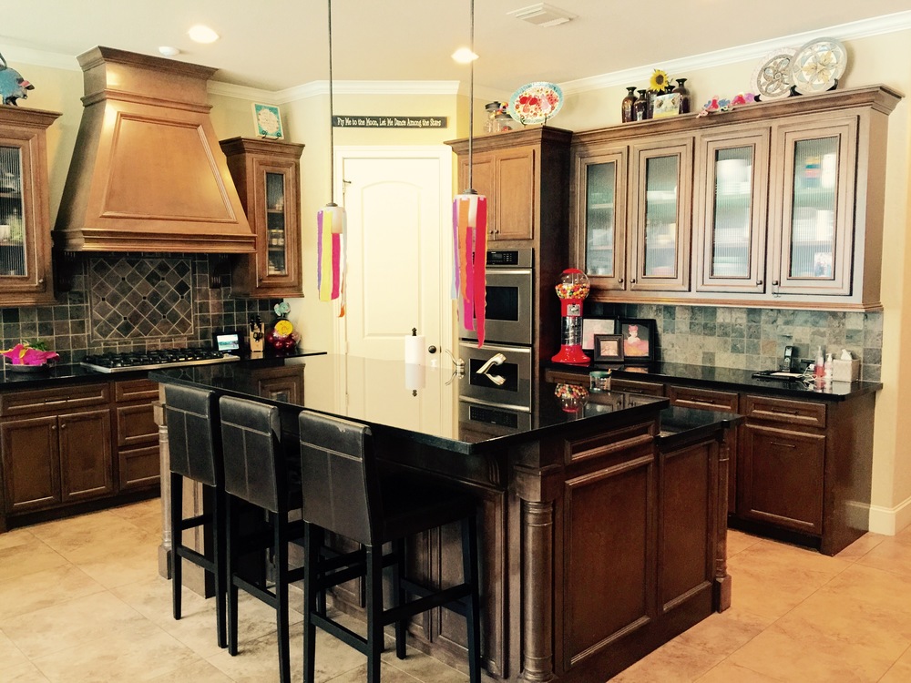
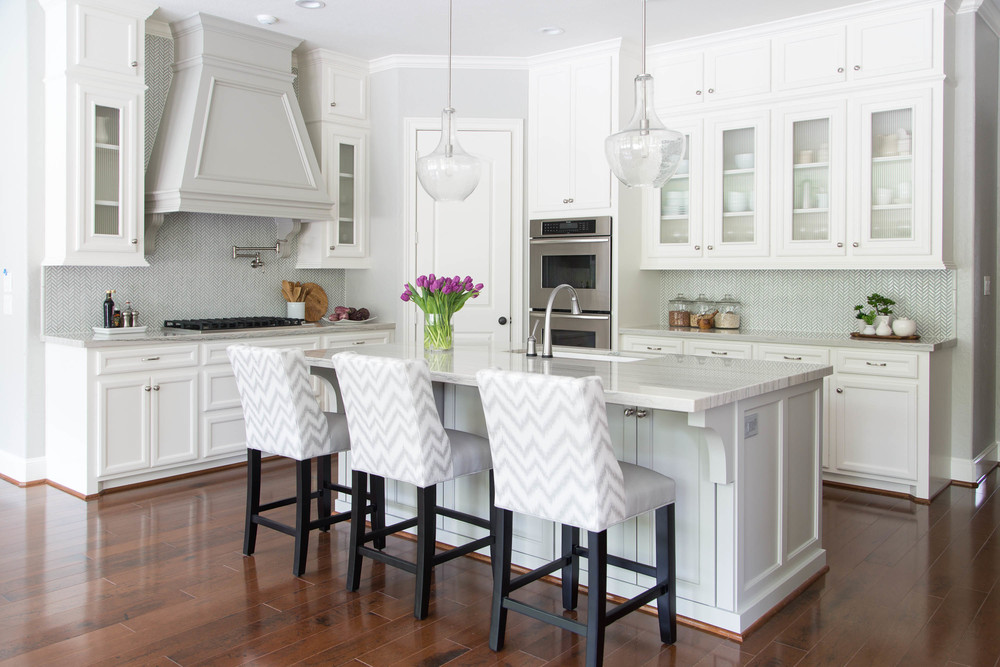
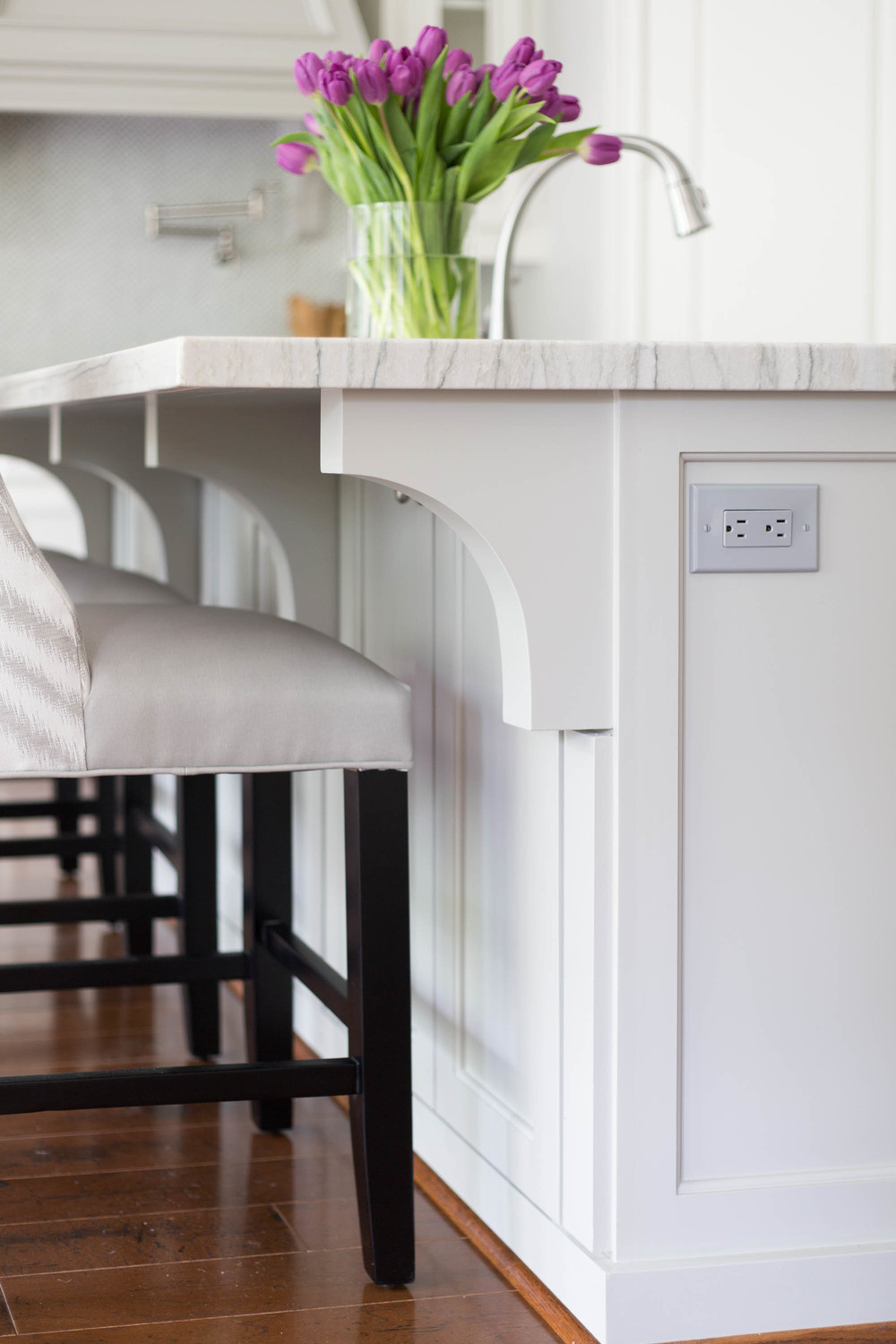
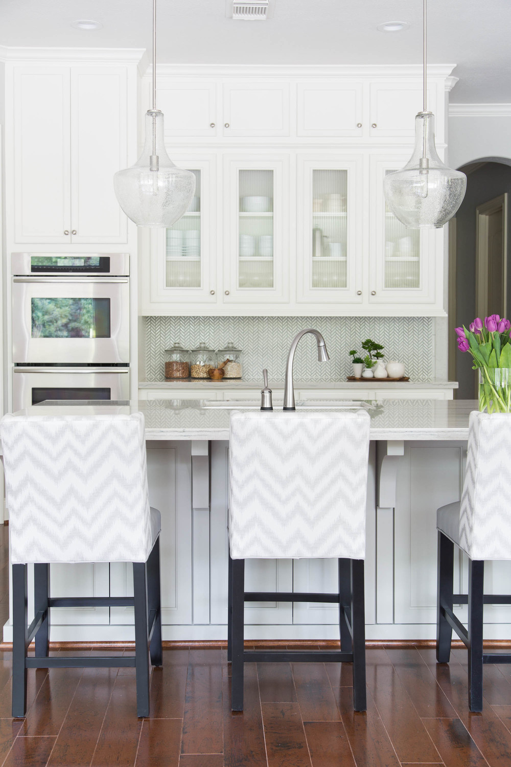
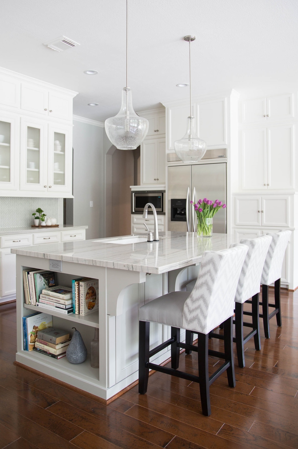
A new island then was top on the list of must-haves. We reduced the depth about a foot, still keeping some nice storage underneath the bar area (we made it just 1' deep instead of being 2' deep - that's where we took the depth), and we lowered the bar height to countertop level. This opened up the kitchen more to make it feel more spacious.
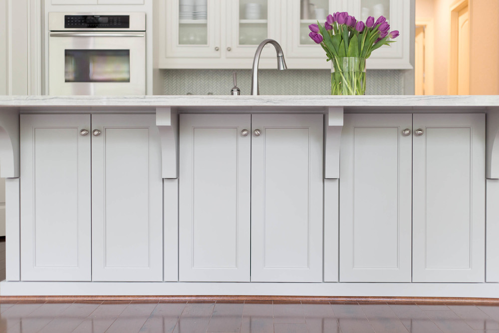
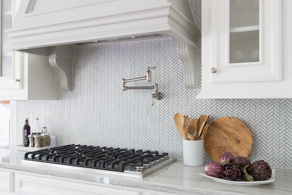
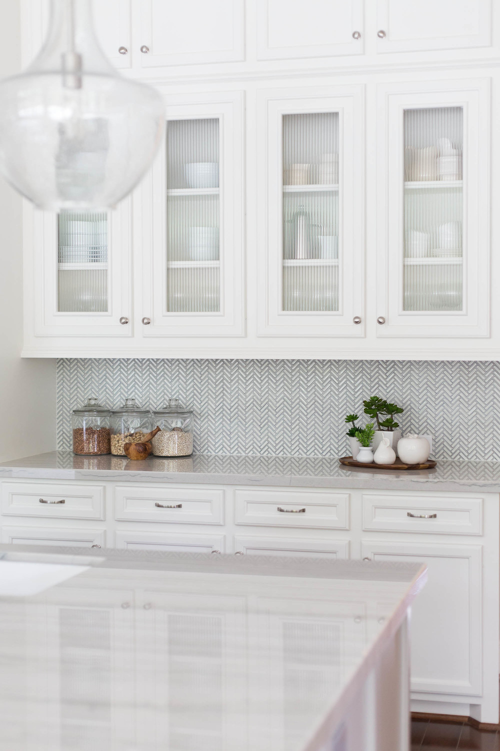
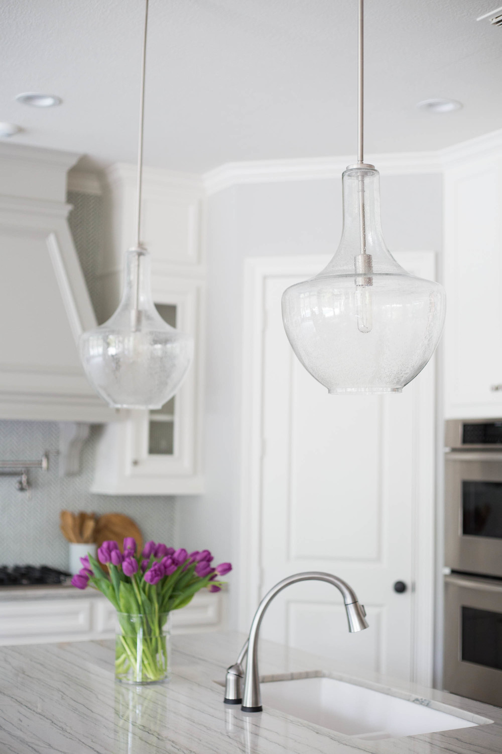
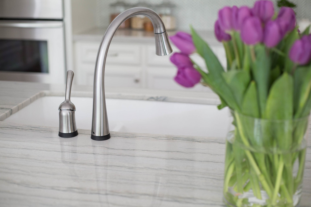
New Macabus White quartzite countertops, an Ann Sacks mosaic tile backsplash, a Blanco Silgranit sink, and adding upper cabinets to the ceiling on top of the existing were also new features that were incorporated to give this space a new look. The clear, seed glass pendants don't get in the way, visually, but make a substantial presence in the room; and the new custom barstools, upholstered in a beautiful wipeable vinyl and indoor/outdoor fabric, are gorgeous and durable additions to the space. I love the cool toned, transitional cabinet pulls we did on the freshly painted cabinetry.
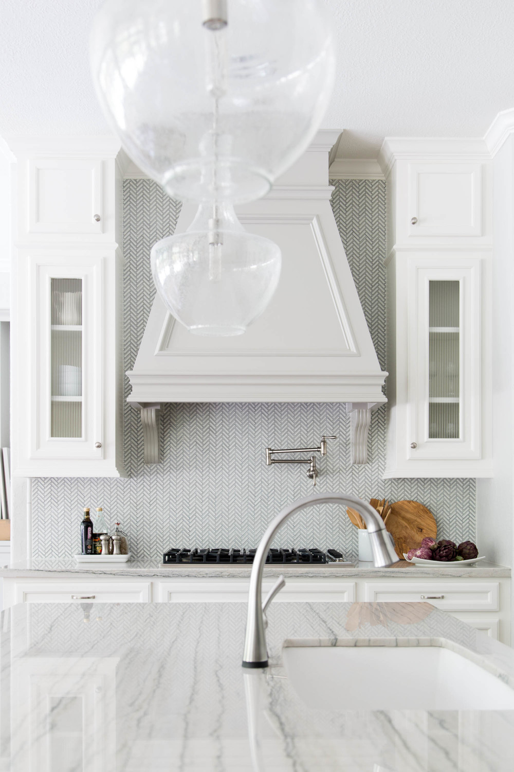
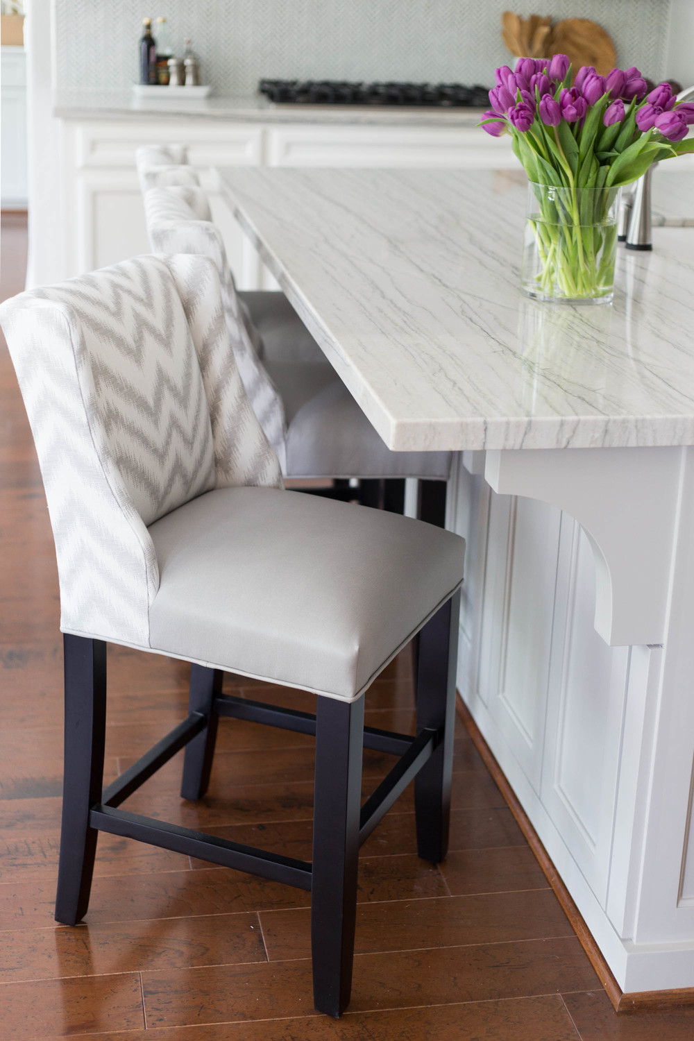
We went with a light gray contrasting color on the island and existing hood, SW Mindful Gray, as well as a pretty white, SW Alabaster, one of my favorites, on the cabinetry. Extending the home's existing wood floors into this space added warmth and a classic look to the end result.
I'm going to let you drool over these “after” photos taken by my daughter, Tori Aston.
And then, in a month or so, I hope to have more pics to share of this lovely outcome! We've done more rooms and the furniture is coming in. So stay tuned!
AFTERS
A Brown & Gold Kitchen Goes Light & Bright!
PROJECT DESIGNER: Carla Aston |
PHOTOGRAPHER: Tori Aston |

Walang komento:
Mag-post ng isang Komento