Interior Designer: Carla Aston | Photographer: Tori Aston
I know you’re gonna love this one. ;-)
I think I’m getting to know my audience pretty well now. You all are savvy design enthusiasts up on all the trends and techniques, and many of you are tackling your own projects yourself. Am I right?
This homeowner was one of you, one of my readers. She had a good idea of what she wanted; she just needed someone to pull it together for her and stretch her a bit. (Okay...well...maybe more than just a bit. ;-)
Yes, from the get-go, we went further with the design and budget than was directed — but it was so worth it.
I’m about to show you some very dramatic before and afters that will blow your socks off! So put your feet up and relax. :-)
See what we started with: a dark, dismal kitchen with shiny oak cabinetry, and wild amoeba-like (cross-cut) pattern countertop in a dark color. If you knew this homeowner, you would know this is so NOT her.
Here are the befores:


She likes light and pretty with a bit of farmhouse style. And we needed to fix a few problems, too.
Here are the before and after layouts:
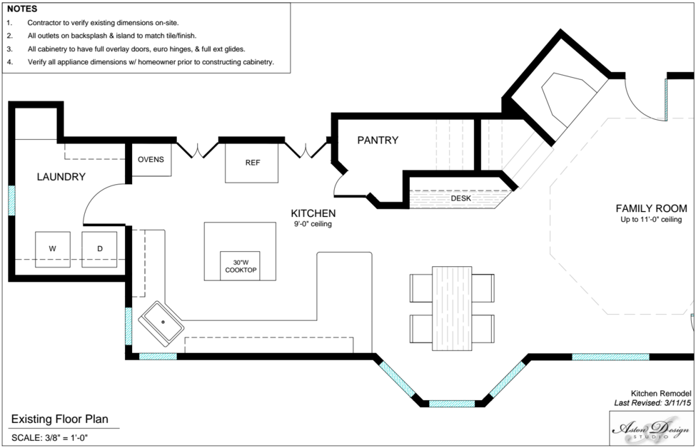
Existing floor plan | Click to enlarge
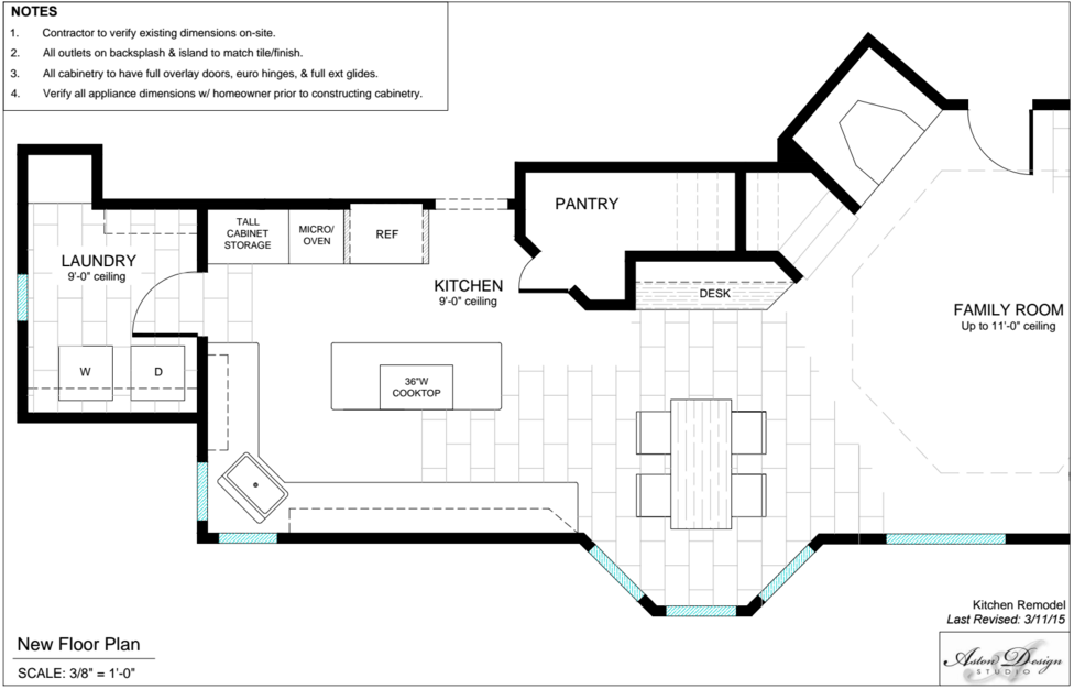
New floor plan | Click to enlarge
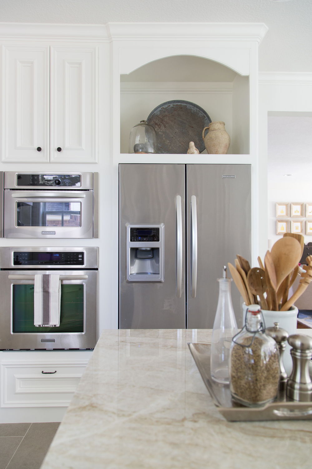
There were two doors to this kitchen, one on each side of the frig, from the adjacent living spaces: one that was used most often, and one that fed directly into the dining room and was hardly used at all. They were really so close together, just a few feet away, so… Why have two, especially when you could build in full height cabinetry for some great additional storage and build in the refrigerator for a cleaner, more custom look? It also helped to move the ovens down a bit from the corner of the space so the oven door could be more accessible and open (without banging the edge of the door moulding which it was doing).
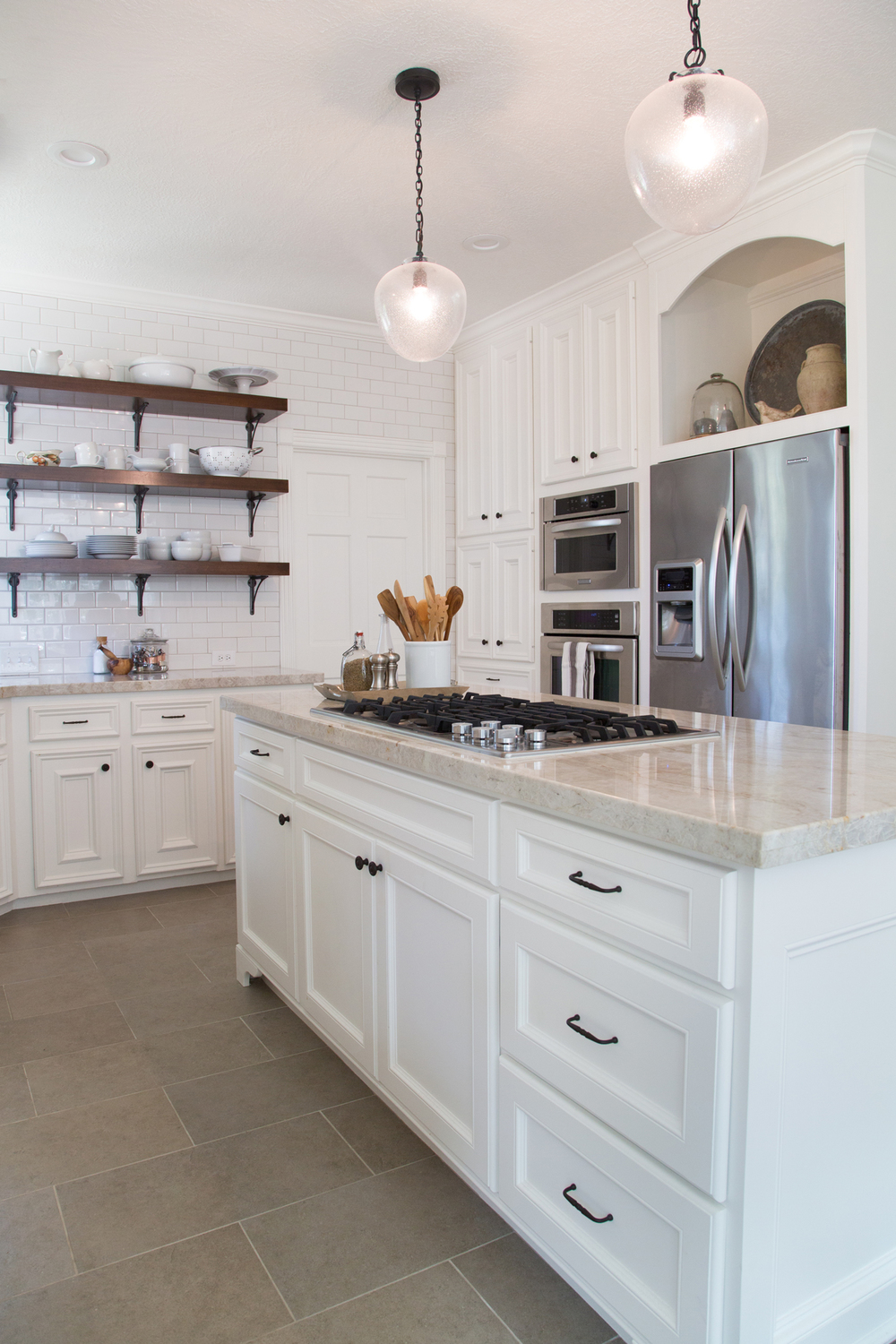
Also in the process: my love affair with bigger islands and no peninsula in the kitchen took charge.
That’s right, we cut off that bar/peninsula and opened up the kitchen more to the breakfast room/family room. We also extended the island in length. How fabulous and open does it appear now, right! See for yourself...
Btw: All 'after' photos taken by photographer Tori Aston.
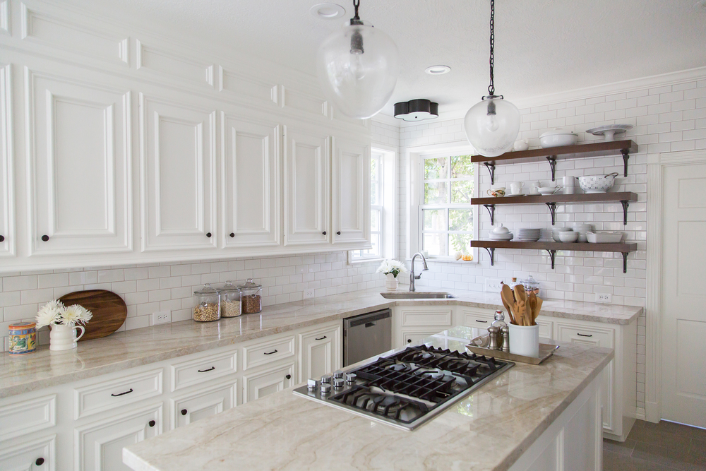
I wrote a post during the construction of this project about how we affected the upper cabinetry along the wall. These existing cabinets were not quite low enough to build a full cabinet above the uppers, but I really wanted to take those cabinets to the ceiling to create a space that felt taller and cleaner-lined. Also, because we were building the full height cabinetry on the other side, I really wanted to match that height. Although I had much preferred just doing new cabinetry overall, my client did not want to spend money on that; so we instead reworked some of the existing to save some dollars.
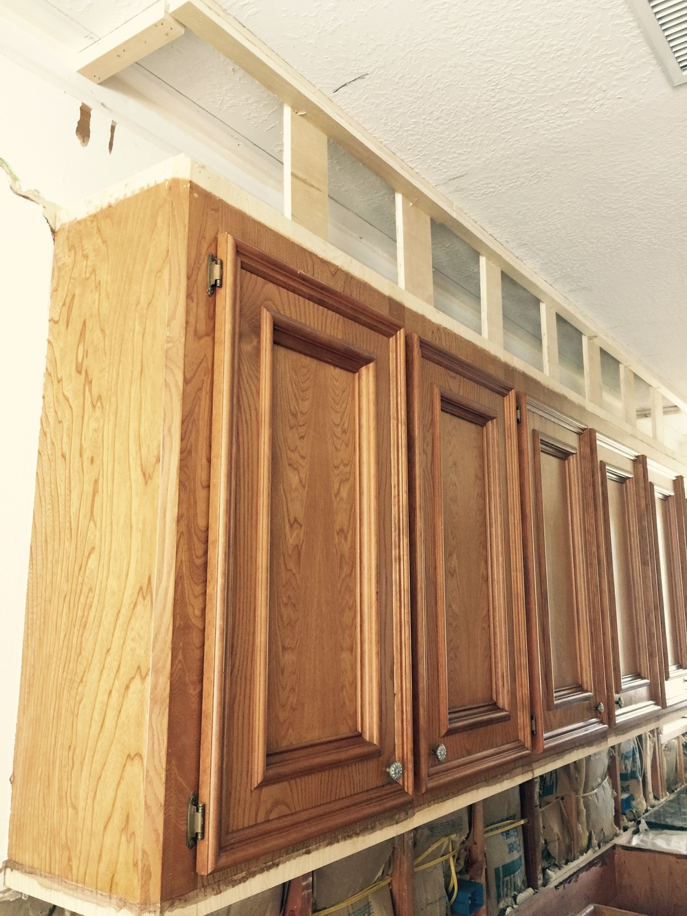
Cabinets under construction
So, we built a box above the existing cabinets and paneled it to give the illusion of taller cabinets. (Yes, we’ve got lots of little tricks like this up our sleeves. :-)
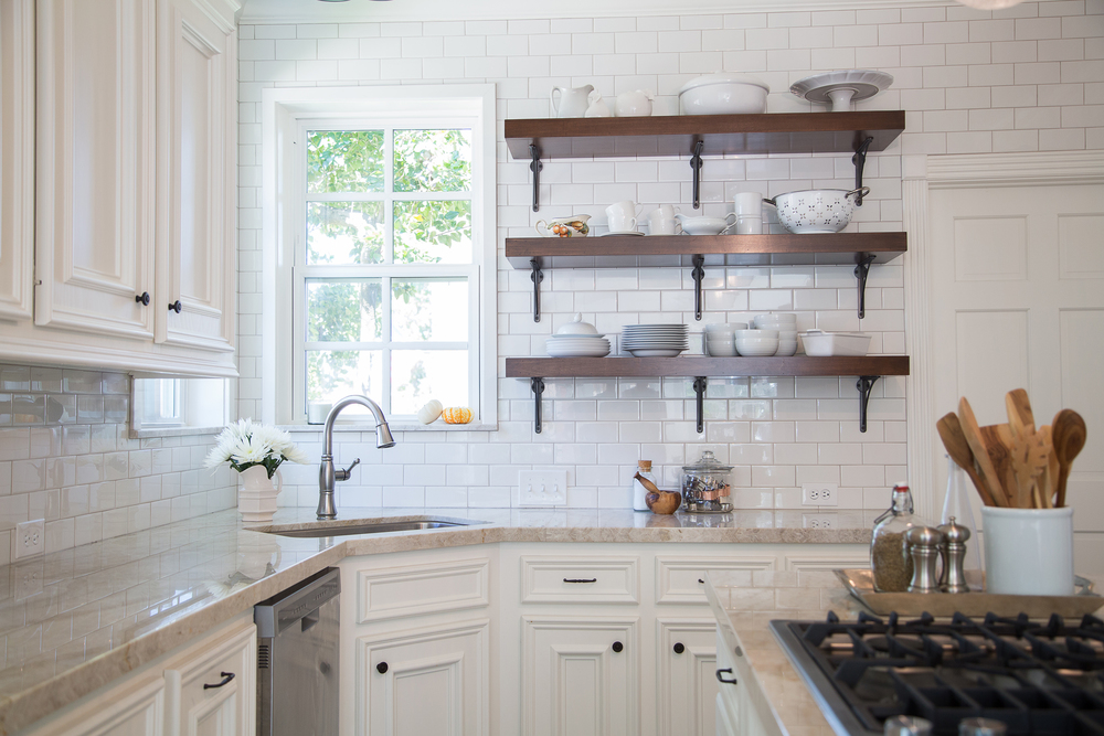
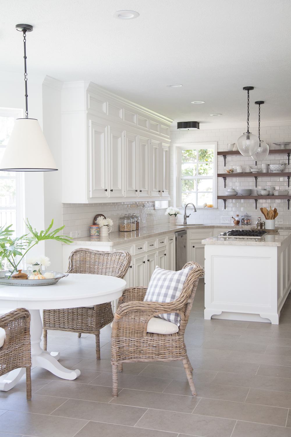
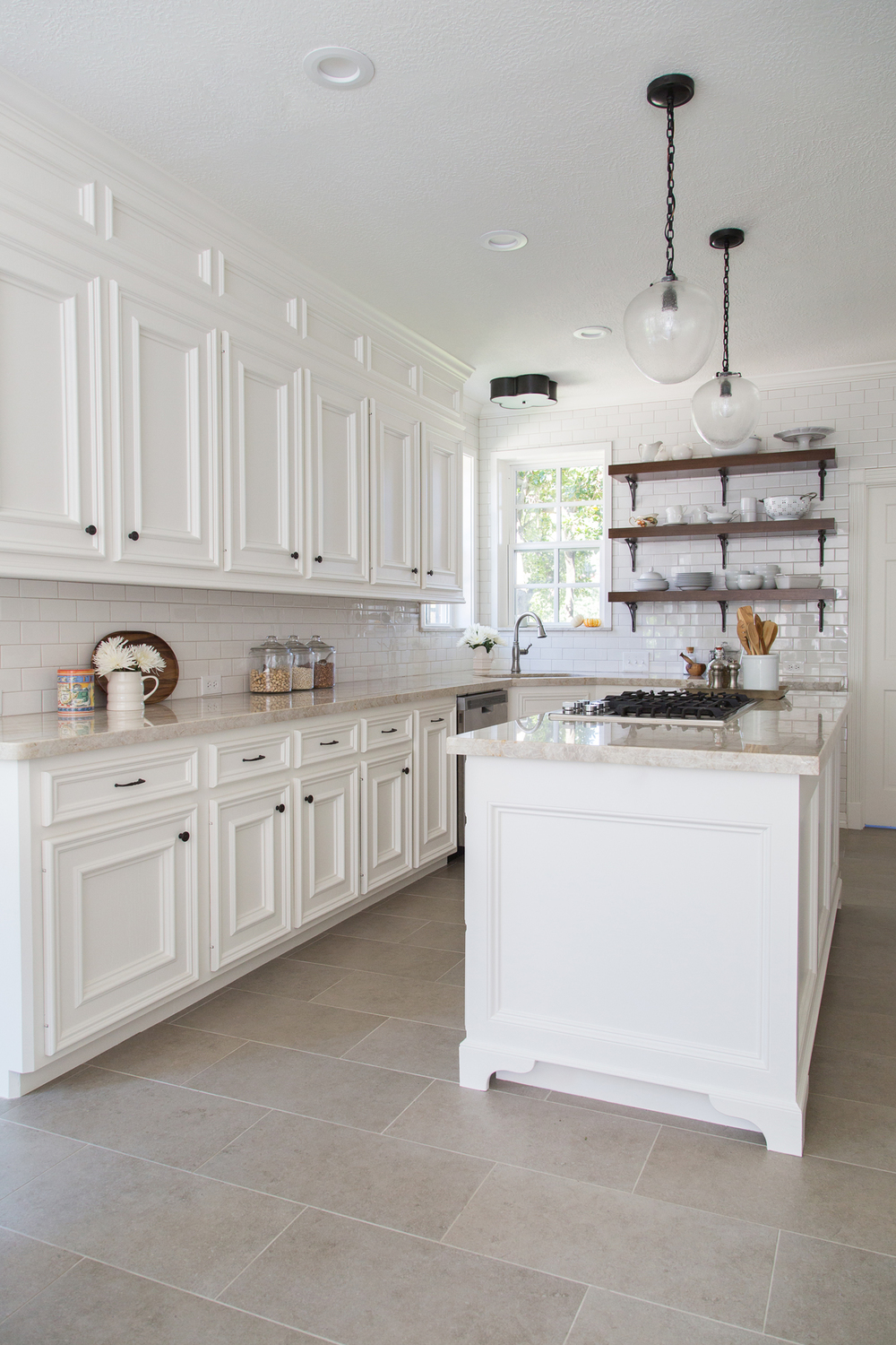
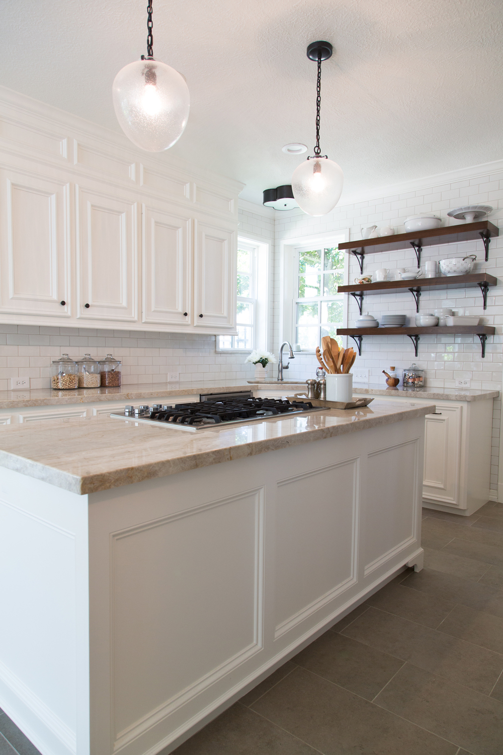
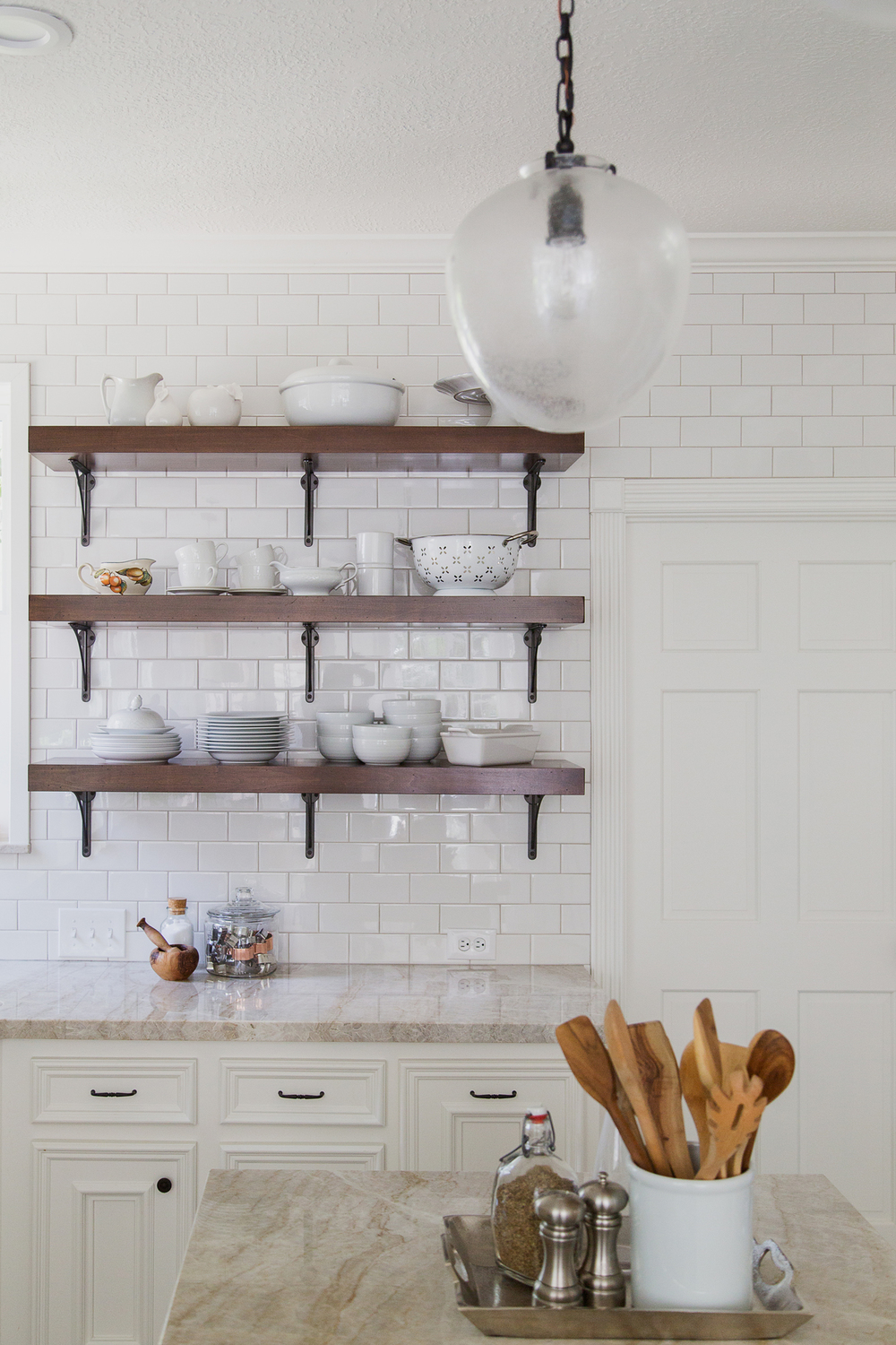
Our client wanted to remove some of the uppers on the end wall, as well as tile the whole wall. It was hugely successful; and kudos to her for that idea. Those shelves are really a focal point of the kitchen and serve to open up the feel of that sink area, which previously had felt shoved into the corner.
Also a big investment and focal point: our gorgeous quartzite countertops in Taj Mahal. I’ve use this material before; and although pricey, it’s always a successful and more durable alternative to white marble.
I LOVE the porcelain tile floor. It’s not too busy, and it’s such a nice greige color that hides everything and provides such a nice base for the white cabinetry. At one point there was talk of downgrading to a less expensive tile, and I’m so glad she went for this one. The quality is there and it shows!
The lighting is another spectacular element in this beautiful white kitchen. It adds a bit of gutsiness to the style ,making it feel like quality resides there. I love the seed glass shades on the glass pendants for that bit of textural feel, yet it’s still a very open look that doesn’t get into your view of the open shelving. The cone over the breakfast table is simple and sleek, yet soft with the diffused light.
All in all, I’d say a dramatic difference was made here.
Wouldn’t you agree? ;-)
AFTERS
A Dark Kitchen Is Made Light & Bright!
PROJECT DESIGNER: Carla Aston |
PHOTOGRAPHER: Tori Aston
CONTRACTOR: Tony Knepper


Walang komento:
Mag-post ng isang Komento