
As an interior designer, using exquisite tiles in my many bathroom and kitchen projects feels a lot like playing with my favorite toys, because...
I LOVE tile! The more of it on the entire walls of my many of my projects the better.
Here are some examples of what I've done with tile that WOWs:
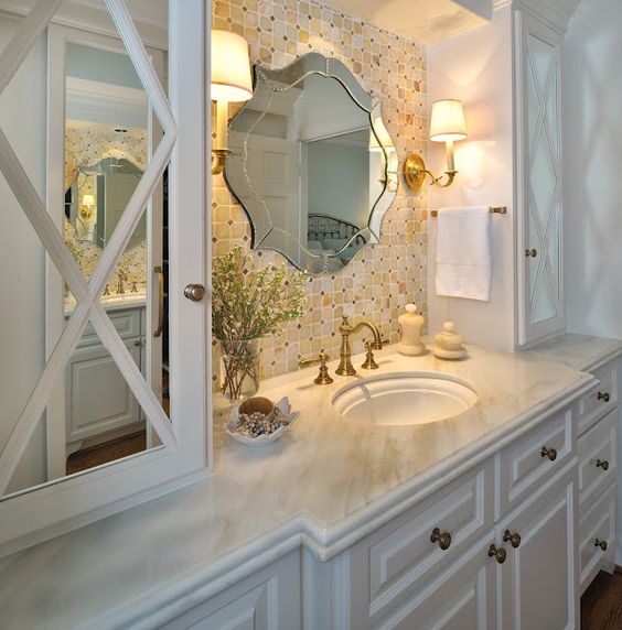
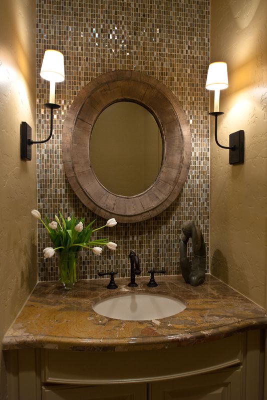
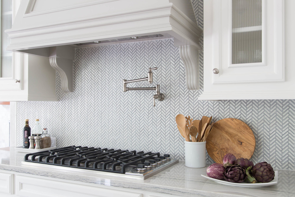
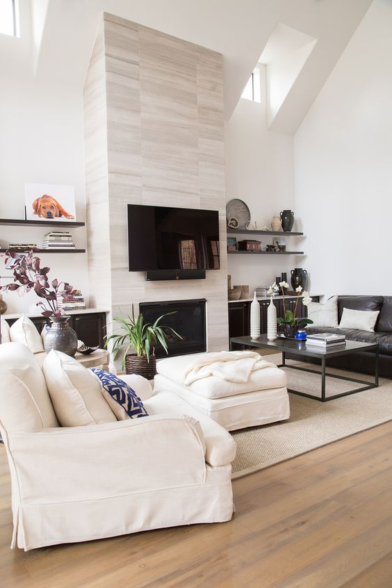
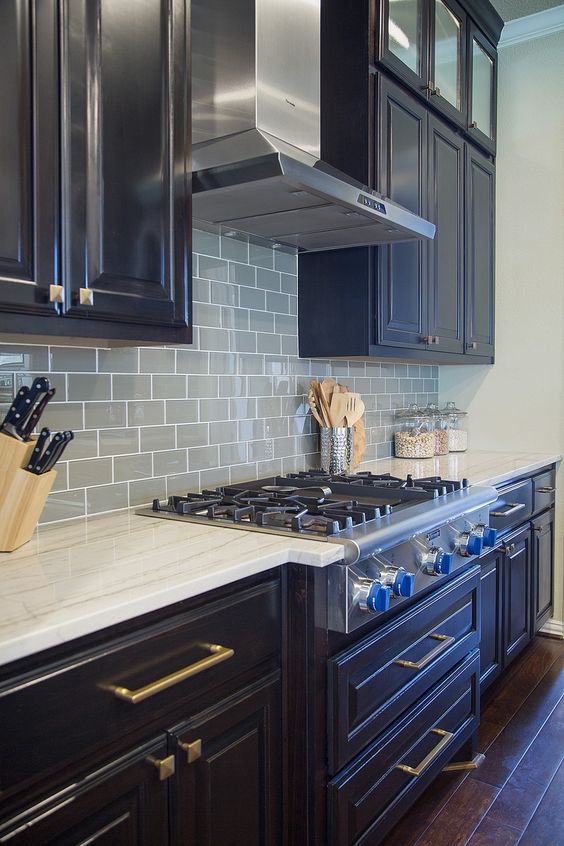
When you come to a designer for a bathroom or kitchen design, chances are they will want to use some extraordinary tile to cover the walls and floors of your project.
They want to provide some WOW and make your project special with products that are unique and hand-picked for your particular wants and needs.
You know, kind of like this:
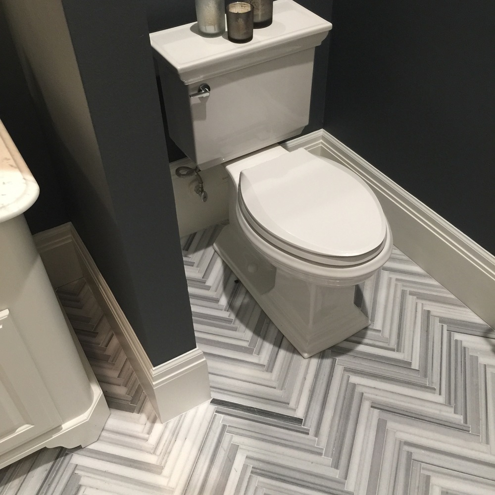
Interior Designer: Carla Aston
However, many times budgets aren't that big; and, when you're covering a wall and you get into cost per square foot, then, well...there goes your money.
Now don't get me wrong, I don't want my clients thinking we can always get away with ordinary tile and have a WOW bathroom or kitchen, but… You can have a great bathroom, for less money, IF you aren't that interested in making a statement with your tile.
IF, perhaps, you focus on something else, like interesting wall finishes, unique mirrors, lighting, cabinetry, etc. OR you focus on the overall drama of having a wall of tile and the pattern created with the grout lines, then a less expensive material, like a plain square tile, can be successfully used to create impact.
I have been noticing more and more projects out there where the tile itself is not really the focus or design star of the room. I've noticed some projects that use an ordinary 4 x 4 or 6 x 6 white tile and have turned out quite remarkable.
So - and I can't believe I'm saying this - if you have to leave the 4 x 4 or 6 x 6 tiles in your bathroom remodel, or if you need budget friendly tile walls in your kitchen, you can create interest and still turn out a beautiful space. You can capitalize on the overall pattern and drama created by doing a single finish all over the place. OR you can focus the drama and the WOW factor elsewhere.
I've got some projects to share today that have used a very basic 4 x 4 or 6 x 6 tile and also have dynamic and powerful design.
Here they are:
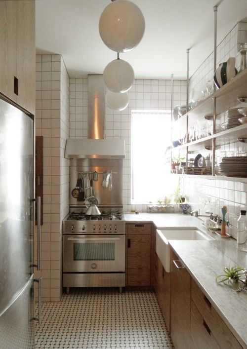
Architect: Lauren Wegel | Image via: Remodelista
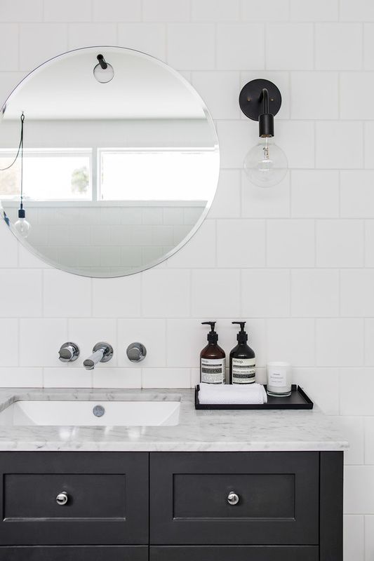
Designer: Denai Kulcsar
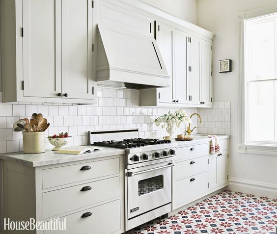
Designer: Grant K. Gibson | Image via: House Beautiful
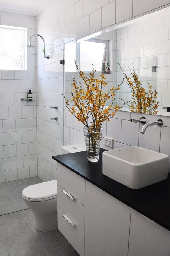
Designer: Carla Karsakis, Etica Studio
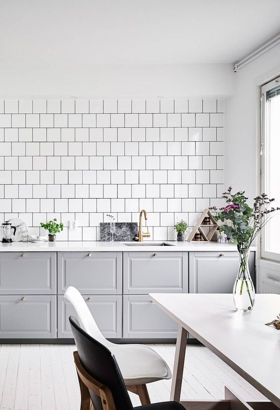
Image via: Dust Jacket Attic | Photo by: Anders Bergstedt
Want to see how I used standard tiles in an interesting random pattern to create a WOW factor in a local deli?
Then check this out:
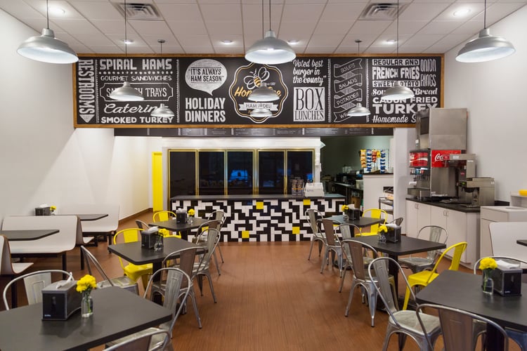
BEFORE & AFTER: A Honey Bee Ham Restaurant Goes From Tired & Dated To Fresh & Delicious!
Walang komento:
Mag-post ng isang Komento