
I’ve shared a couple of posts about my kitchen remodel here, here, and here. But I haven’t yet shared much about the finishes or materials I’ll be using.
Frankly, even though I’ve been thinking about my kitchen remodel for a long time, and my husband was pushing me to “just do it”, AND we have had boxed new appliances in the garage for almost 2 years, one of the reasons I hadn’t yet tackled it is because…
I hadn’t quite made all the design decisions I needed to make.
When it comes to me and my personal taste (like and dislikes), I find it really hard to focus on best choices, because I see and love everything out there. I am constantly exposed to beautiful products, as well as the latest and greatest materials and styles, and it confuses my own personal choices when it comes to designing my own home.
I know all too well how I’ve gotten off-track from my own personal style and taste in my home and regretted it later. That’s why I want to make sure I stay true to what I love, no matter what the trend of the moment may be.
I’ve always had a white kitchen. In our first home we had white cabinets; and in the two homes after that one, I painted the cabinets white. I had a white kitchen in this house, too. (Although the cabinetry had that plastic coating on it, like they have in apartments. Boo.)
Bottom line: I love a white kitchen. They feel fresh, clean, and simple. And I love a simple look.
Hence why I’m going with white kitchen cabinetry. ;-)
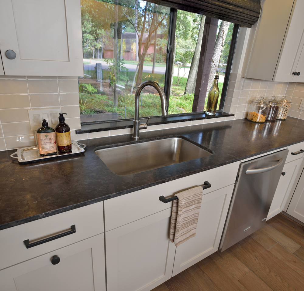
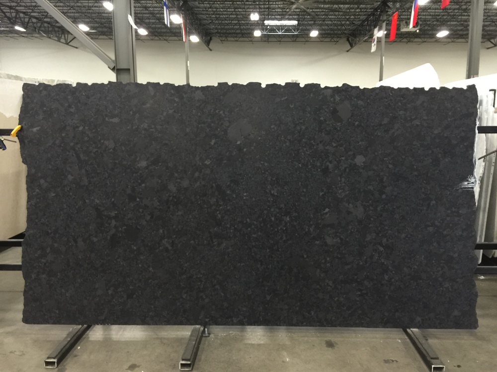
For my countertops, I’m going back to a favorite of mine: Marron Cohiba granite in a leather finish. I used it on this project for a young bachelor and loved it there. I’ve literally had this material sample pulled for my kitchen for about five years. I think if I’ve stayed true to this “like” for so long it must be a proven fave for me. I like that it is a warm black, much like the SW Black Fox color I’ve used on all the doors and stair railings in my home. I feel like using it in my kitchen, repeats that color and contrast I have going on elsewhere in the house.
Interior Designer: Carla Aston
RELATED ARTICLE:
Before & After: A Dated House Gets A Contemporary Revival For A Young Bachelor
Interior Designer: Carla Aston
Interior Designer: Carla Aston
RELATED ARTICLE:
Before & After: A Home Office Goes From 'Embarrassing' To Elegantly Inviting
I selected the slabs. They are more black than brown (yay!) and very consistent with the texture and scale of the matrix. These granite slabs can have extra large blobs or shapes periodically show up in the pattern; and, on occasion, they can even have tiny white veins. I’m so excited to find these cleaner slabs in this particularly darker, less-brown color. I love the leather finish because it adds that bit of a rustic, textural look that I love, in a subtle way.
For a hint of fine detail, I’m doing a 1 ½” edge with a partial ogee. I love a more rustic vibe, I have texture, contrast, and “gutsiness” in my home, but the architecture — and I use that term very loosely as this is a “builder special” that isn’t all that special :-) — is traditional in design, and I don’t want to veer too far away from the style of the house.
Here’s my sink and faucet. Ever since I used a big single-bowl sink in this house I stayed in in Ventura, I’ve wanted one. I’m all for the very straight-lined geometric shape this sink has; and what makes it better than most of the very rectangular sinks out there is that the corners are ever so slightly rounded so that it’s easier to clean. Blanco products are so well made and beautiful to see and touch.
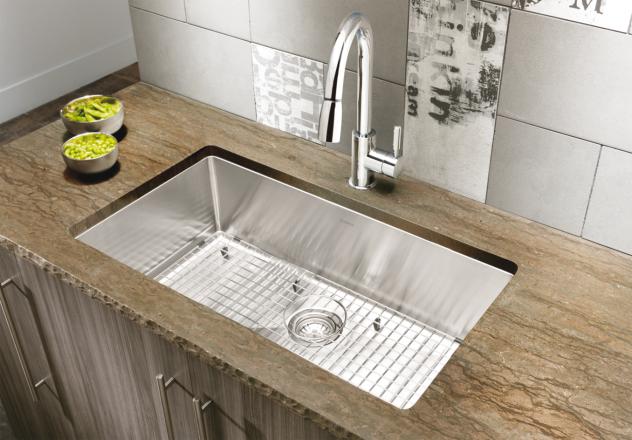
BLANCO QUATRUS™ R15 Super Single Bowl
I’ve always loved this faucet for the “cook’s kitchen” vibe it provides. I kind of wanted to make a statement there but didn’t want anything too modern or too traditional. This is perfect, and I’ve always been keen on it. Both of these are purchased through my local Ferguson’s showroom, whom I work with all the time.
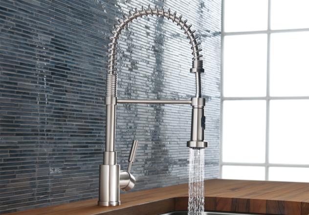
BLANCO MERIDIAN™ Semi Professional
I debated my flooring for a long time. At one time I thought about continuing my wood floors in there, but my husband cooks now and things get wet everywhere. With wood floors I would be worrying about wiping up spills and water droplets, and I’m just not that into maintenance these days. :-)
I also considered doing a statement floor. I love concrete tiles and dramatic, high contrast patterns. (I’m really into high contrast because I’m a "winter". :-) Also, this is my remodel to do what I want and, well...I want a little drama. After all, I am a designer; and designers want flair. I want something a little different and memorable.
I thought about something like these:

Image source: ElleDecor.com

Image source: enmiespaciovital.com
However, with the way my house is laid out, the only way you’d see the floor is from the door opening and times when you are in the kitchen. That type of flooring would be expensive and would be THE STAR of the kitchen, BUT it wasn’t the proper location for THE STAR — ”THE STAR” being...
That one long wall with cabinetry and the new pantry door. It’s the wall that is, essentially, also the wall of my living room. The focus, the money, the drama, the value, the design statement...it needed to be on that wall, right where it would be seen and appreciated most. Everything else in the kitchen should support that, visually. (I’ll post about the wall later.)
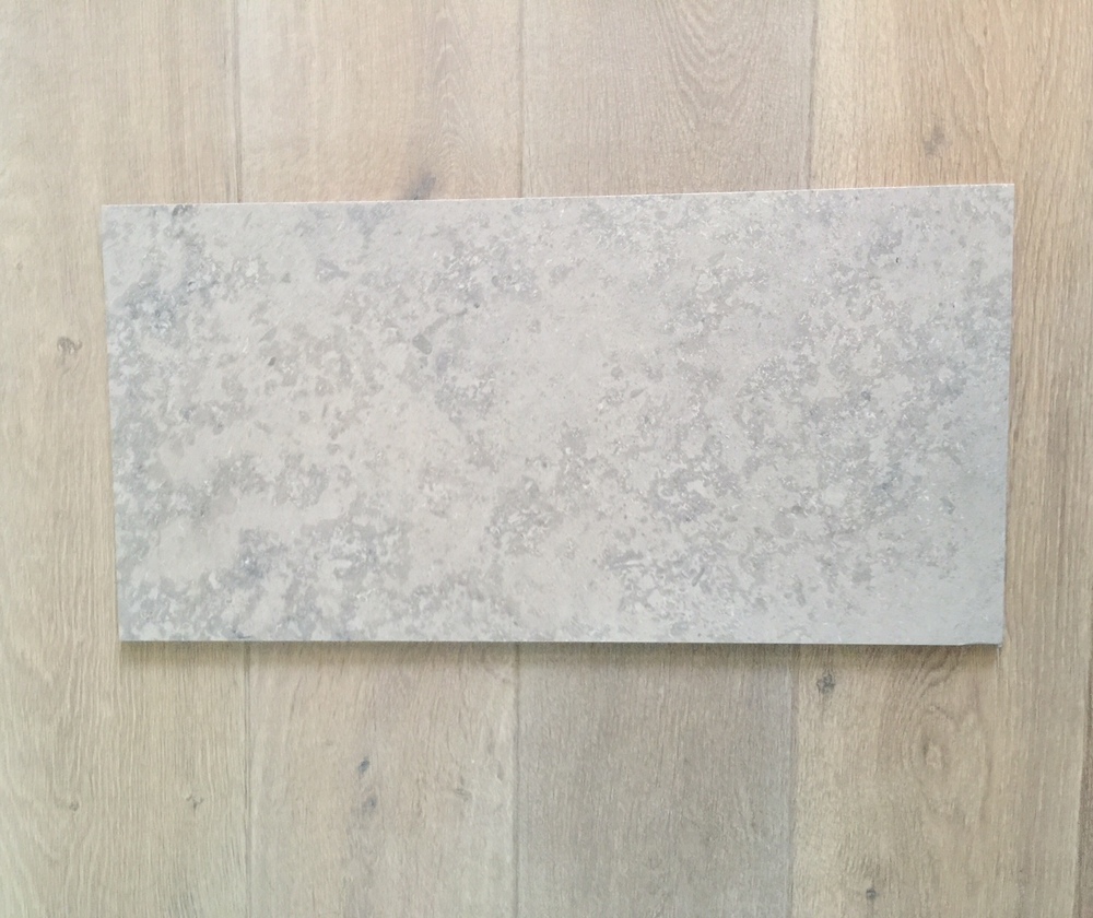
So for the floor I went with a beautiful 12 x 24 limestone look porcelain. It is the most amazing look-alike I’ve seen to date. Don’t get me wrong...it’s definitely pricey. I didn’t skimp on the material cost, but I didn’t want the floor to make a statement; and I wanted durability, so this beautiful choice was the answer. It is an exact color match to my wood floor; so, visually, my flooring just flows from one space to the next. And I’ll run the tile floor pattern as a running bond lay (to hint at the traditional architecture of my home), as well as run the 12” side of the tile from the sink side to the frig wall of the kitchen to visually widen the space a bit.

Click to enlarge fullscreen


So far we’ve talked about...
The layout, as well as some changes I've made. And here in this post we’ve covered cabinets, tile floor, countertop, sink and faucet. I’ll get more into the jewelry later (cabinet pulls and lighting), as well as my design statement in the kitchen > that wall elevation that includes backsplash, upper cabinets, and pantry door (you know, THE STAR :-)
BTW… Did you see all the links I included above within the post? I know...I went a little nuts with them; but I inserted them to show you how I apply my design philosophies to my work, as well as all the design decisions I make along the way. Many times these are unspoken, even with my own clients; I usually don’t get into sharing the “whys”. But, just so you understand… there’s always a “why”. ;-)
Walang komento:
Mag-post ng isang Komento