It's no secret that I often struggle when trying to add colorful flowers to an interior design project that I'm about to have professionally photographed. Anyone who reads DESIGNED knows it's one of my weaknesses.
When you first take a look at a project I have designed, I don't want the flowers that have been scattered about the room to be the first thing you see. I want my work to shine as a result of design decisions I made that were influenced by my unique creativity and my understandings regarding the principles of design. Sure, if a flower placed here or there accentuates her room, that's great; but if they overshadow other parts of the room that truly deserve to the attention of all who enter, then my stomach can't help but turn a little bit.
Of course... bright, vibrant color is attractive to the eye. I know that. You know that. Anyone knows that. The bolder, the brighter, the more colorful something is, the greater the odds are that you won't be able to take your eyes off of what's captivating them.
Want to know who else understands the positive reaction a colorful canvas can create in those who admire it?
Editors — of magazines, of websites, of books, etc. — the very people I want to impress with the pictures that are taken of this space I have designed and am oh so proud of. Hence why I want to make sure everything my photographer's camera captures looks 100% remarkable. ;-)
I've already explained, in detail, in a previous post, how this particular room came to be.
I'm familiar with the home, I'm familiar with the client, and I'm very familiar with her design preferences; design preferences that include a love of grays, taupes, whites, rustic finishes, and a little bit of bling. With this palette in place, I knew it would be tough trying to add the touch of bright color that I wanted my photographs to contain.
But then I had my "Ah-ha!" moment...
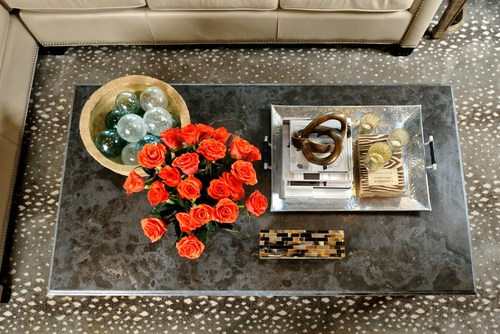
The coffee table!
The coffee table would be the perfect place to add the color I so desperately wanted to feature! ;-)
When you take a look at the coffee table from above, it actually looks quite good.
However, when you're roaming around in the space and see it, there was something about it that just didn't feel right. And my client agreed.
Adjustments had to be made.
The coffee table's canvas
Doesn’t she have the most beautiful backdrop for what turned out to be a beautifully styled coffee table? I couldn’t have asked for a more perfect vignette.
I love that Stark antelope rug and the limestone-topped coffee table — they look great with her quilted leather sectional. Those plump pillows in subtle patterns, as well as the textures, softened the overall look of the room. And we even had a lovely doggy model who blended in wonderfully with our color scheme! :-)
How I styled the coffee table
To add some pizzazz to the family room I brought in some gorgeous, coral colored roses. Combined with the room's cool and warm neutrals, I was able to create a nice, sophisticated effect.
Check out our objects below:


Round Top was going on at the same time I worked on this project. One of my excursions out there led me to a French dealer who had these beautiful antique paper mache bowls. I loved that they were lightweight, looked like stone, and were authentically antique.
The glass floats are old too, and also found at Round Top from a dealer who specializes in objects from the ocean, such as shells, buoys, and all kinds of old nautical gear. I visit him every time I go.

The tray was purchased at Dallas Market about a year ago, and I had been keeping it stored in my secret storage unit that's full of styling accessories. I wanted something to shine on the limestone top of the table, as well as be large enough to occupy a considerable amount of space, yet not so much that I couldn't add additional items around it.
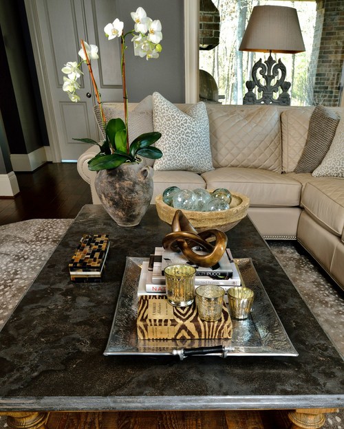
I brought some coffee table books of my own (design books of course), all in neutral colors, (No red covers here!) My precious Osa Johnson book, "I Married Adventure", adorned in the zebra print, fit in perfectly.
Then we have the knot! That bronze knot was ordered from one of my accessory vendors, last fall. It was backordered forever, but worth the wait! It works beautifully here on top of the books. Everyone who sees it inevitably picks it up to see why it doesn’t collapse on itself.
The mercury glass candleholders served as a bit of bling for my client. I always love candles of some kind on a coffee table.
I have an obsession with boxes and collect them myself. The one here on the table is new, from a local designer showroom.
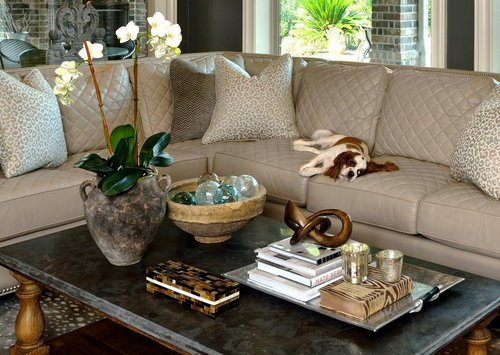
Finally, the flowers. We tried to use the roses; and while they do look great from above, my client and I preferred the white orchid in the Turkish olive jar (also from a Round Top dealer). However, just in case our hunch was wrong, we went ahead and photographed both. :-)

With an assortment of objects on the table — some light, some dark, some warm, some cool, some placed high some placed low, some with rough textures some that shine — all of the contrast was able to effectively create a lot of visual interest...interest I know my client loves and, hopefully, editors will too. ;-)
Want more coffee table styling tips from the web's most popular interior design bloggers? Indulge in any of the posts below!


Participating design bloggers include...
- Savvy Southern Style
- Simple Details
- T & G Interiors
- The Enchanted Home
- The Relished Roost
- DESIGNED w/ Carla Aston
CLICK HERE for INSTANT ACCESS!
Walang komento:
Mag-post ng isang Komento