Here we go again! Friends I’m so happy to announce I have a new blank canvas to work with, last week we closed escrow on the purchase of another house in Las Vegas, like I’ve done before I’ll be traveling back and forth once a month to oversee the renovation.
Here is a first glance at part of the kitchen and dining room. Everything you see will go, I am reconfiguring and modernizing the space, changing it all. That old florescent light box will come out and so will the dated ceiling fan. New recessed lighting, a chandelier, and pendants over the kitchen island will replace them. Adding wood beams is also part of the plan. Also I’ll need a chandelier to drop down over the dining table. That said, it brought to my attention the topic of mixing light fixtures in shared kitchen and dining spaces like this one.
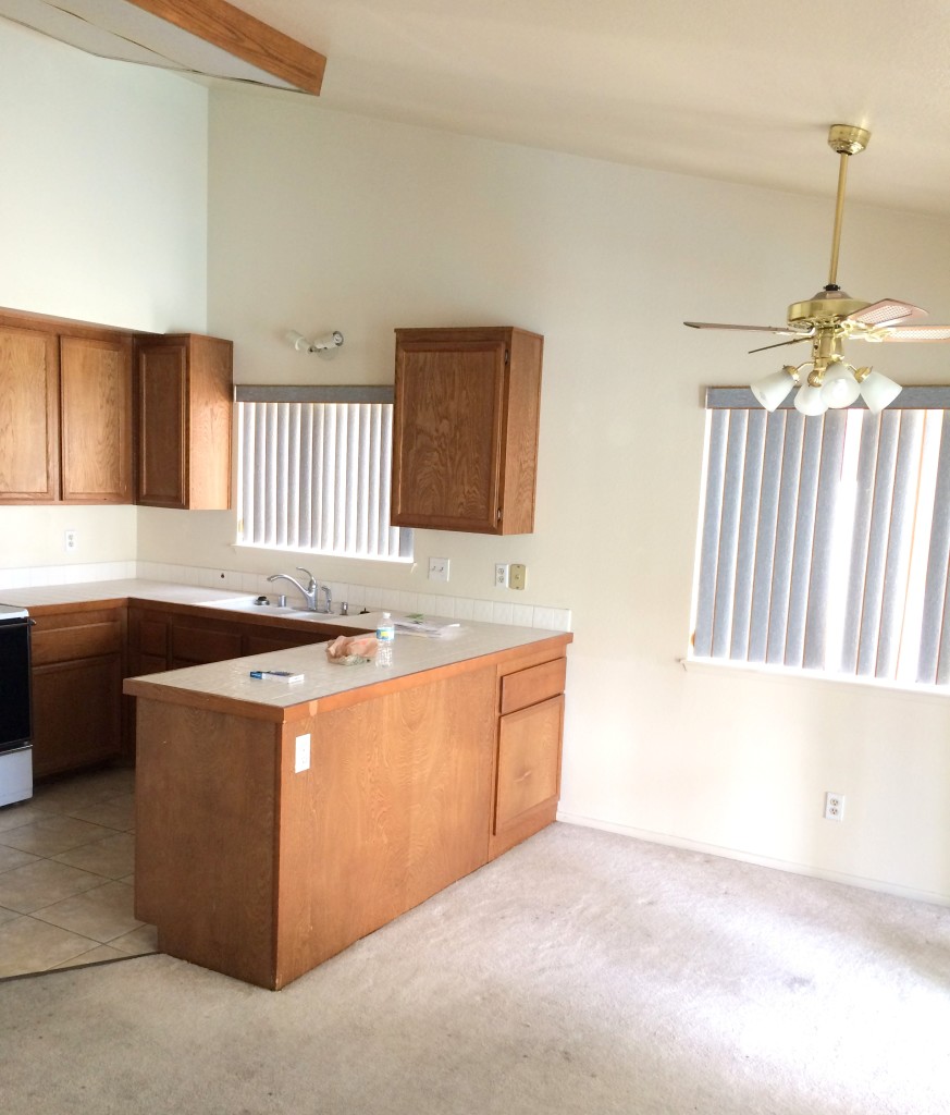
I don’t believe this is a rule written in stone by any means, but I do know this, the one no fail way to mix light fixtures in close spaces like the kitchen and dining room combo above is to match the finish of the fixtures but vary the shape.
In this recent kitchen remodel I combined pale wood finishes in different shapes for the pendants and chandelier because they were close to each other in one connected space. Varying the shapes keeps it interesting, matching the finishes keeps it clean. Here are three examples of the same concept, in styles from transitional to contemporary.
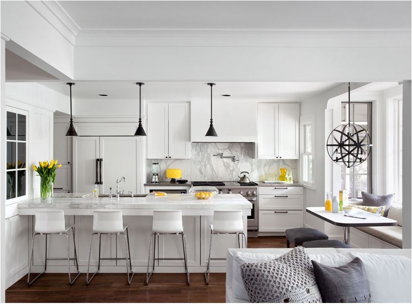
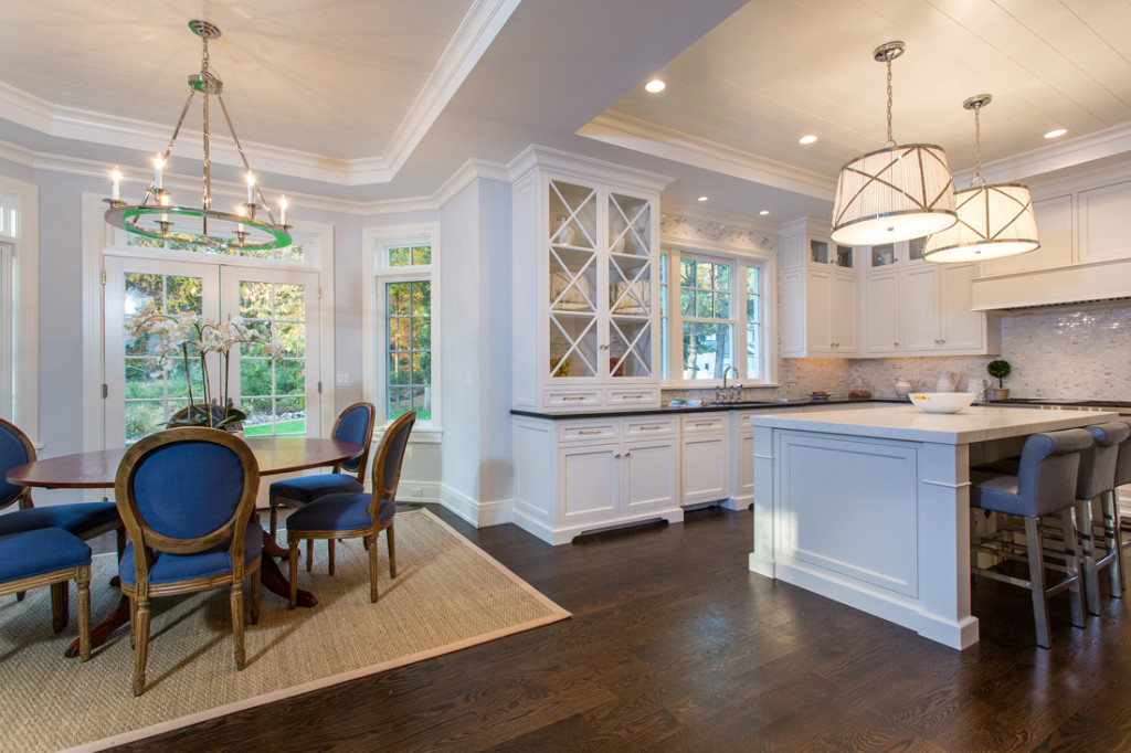
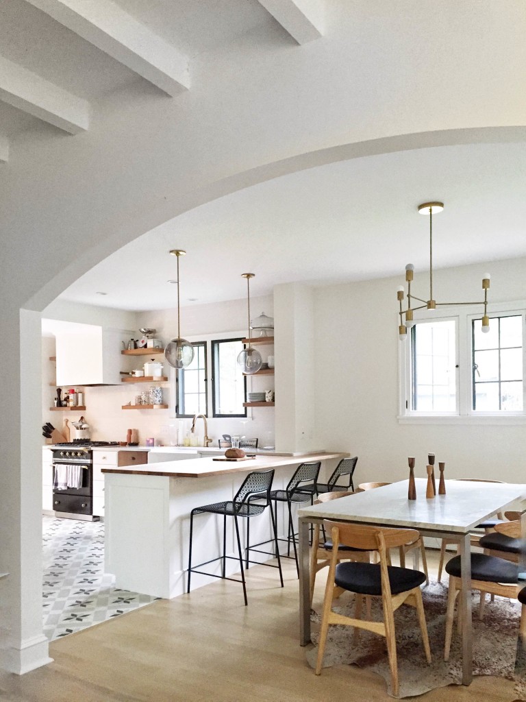
I created four more examples using the same trick: pairing chandeliers and pendants in different shapes but the same metal finishes:
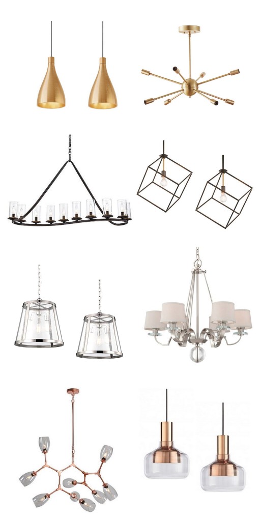
1) Eight arm sputnik & brass pendants 2) heritage bronze and glass chandelier with be squared bronze pendants 3) polished nickel pendants with silver & glass chandelier 4) Nine light copper chandelier with copper & glass pendants.
*some affiliate links used
I don’t subscribe to the notion that the finishes on light fixtures in adjacent spaces should always match, there are no rules other than fixtures close together should complement each other, but it is a great designer trick for making sure fixtures that are relatively close together look cohesive and at the same time it keeps the lighting interesting.
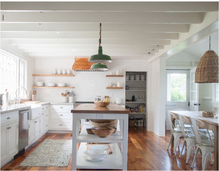
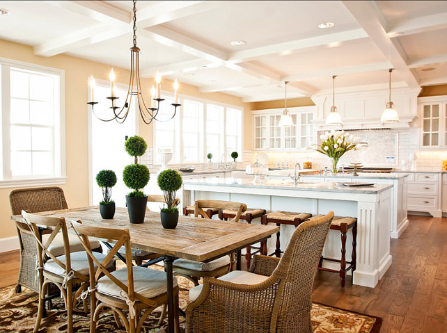
If you want to use color or texture (woven, shell, etc.) you can always mix it up, here is a good example of how to do it. In this cottage kitchen the homeowner mixed a large scale textural basket weave pendant with porcelain enamel pendants. The same is happening in the traditional kitchen and dining space below, the finishes on the fixtures are different but the styles are complementary.
Speaking of great lighting, I also rounded up some favorite floor lamps over at Lamps Plus today with ideas on where to use them. I’ll be updating you on the renovation as it happens, much more to come!
..
Walang komento:
Mag-post ng isang Komento