Image via: Remodelista
Awkward -- That’s what they are.
There’s no better word them. I’ve mentioned this before.
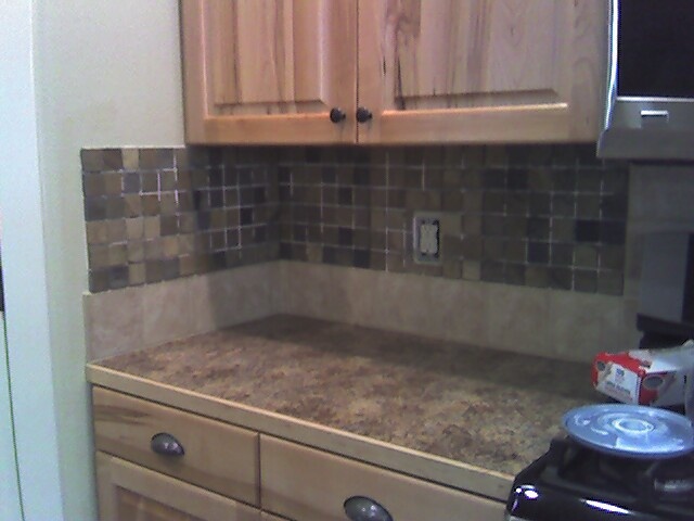
When you have a backsplash on the back wall at your kitchen countertops, and you don’t NEED to put a backsplash on the short side walls -- because there will be no water or grease splattered there anyway -- then please...
Don’t do it - IT'S AWKWARD. It just kind of hangs up there in mid-air without a proper place to stop.
See what I mean?


Left - At least this one is trimmed out and blends with the wall color so as not to attract attention.
If you have a short backsplash, something 4, 6, or 9” high, it’s easier to get away with a side backsplash.
The backsplash visually blends in with the countertop, making it feel married to that. And it doesn't end up being so high up on the wall, all by itself.

Designer: Kay Douglass via South of Market

Image via: Design Sponge

Image via: Remodelista

Image via: Country Living
Left: This backsplash really didn’t need to turn the corner. It could’ve been left on the back wall of the kitchen. But at least it’s not 18” high!

Need design advice? Click here!
If you’re in a kitchen, and you’re doing the countertop-to-upper-cabinet-18”-high-backsplash, it’s best not to wrap that around to the side wall.
As I always say... Transitioning materials on an inside corner is always best. Don’t you agree?
Gallery
{ Click each image to enlarge full screen. Click HERE for their sources. }

Designer: McGill Design Group

Image via: Apartment Therapy

Image via: Apartment Therapy

Image via:

Image via: MATCH REMODELING

Image via :Decorpad

Designer: Fiorella Design
I'm just doing the backsplash and so far I like it! Thanks for the pics... that helped!
TumugonBurahin