I was looking through some favorite images on Pinterest and realized that one of the reasons I found them so captivating was the designers attention to negative space. When we decorate were so tempted tofill the emptiness with furniture, art, and accents, yet often less is so much more.
Negative space is used in art and graphic design in a calculated way, the point being to use blank space to place emphasis on the highlighted subject. In interior design, the idea is very much the same; it translates to calculated restraint. Rather than filling up all the walls or corners with objects, spaces, or areas are left purposefully blank.
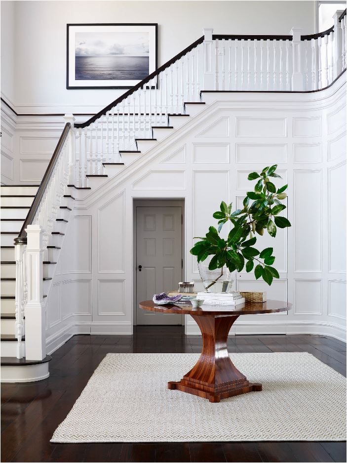
One effect that stems from such calculated restraint is it allows specific decor to shine. In this classic entry, using more art or furnishings or color would take away from the isolated beauty of the landscape print, the pedestal table, and the leafy branches.

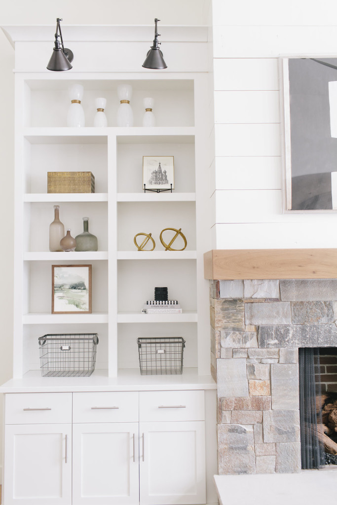
Another direct result from the purposeful use of negative space is that your home will simply feel less cluttered. Walls or shelves that are too crowded can leave one feeling claustrophobic. An open bookshelf is the perfect example, certainly it can be used for its practical purpose and filled to the brim with books and accessories.
However our desire to collect, store, and display all of our things is in competition with the concept of minimalism and the serenity that stems from an uncluttered nook. See how the white space that surrounds the decor on these shelves creates a calming effect because instead of filling them completely, the designers chose negative space to surround the objects instead of more things.

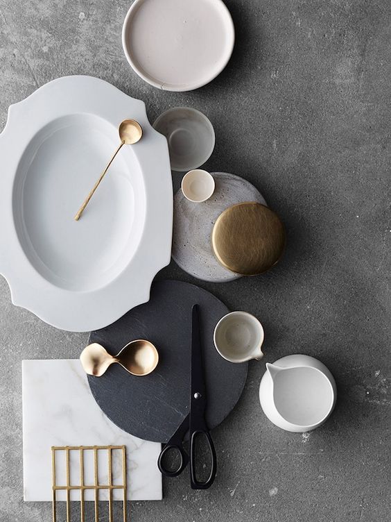
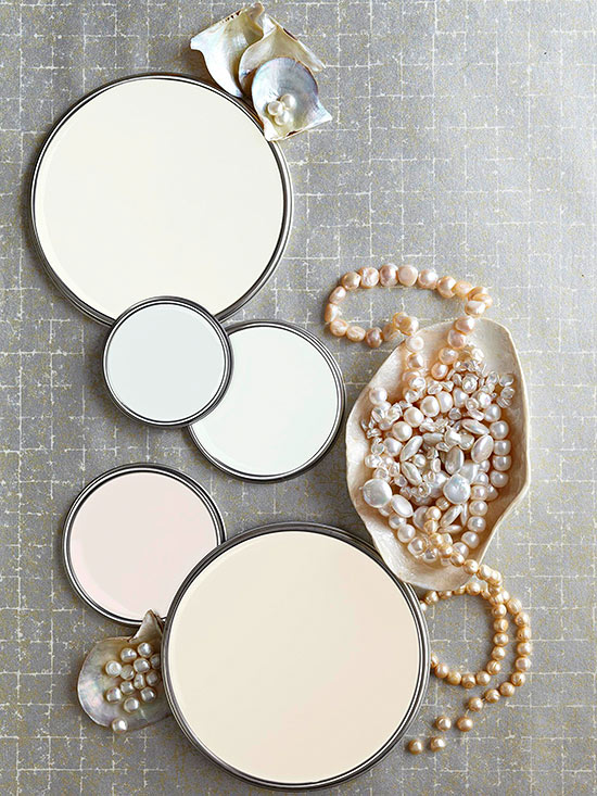
Negative space is also a great styling tool. The use of negative space in photography purposefullyallows for a place of emptiness. The result? It puts the focus on the objects that are the subject of the photo shoot. Magazines love this technique because this is where they can add copy (words) in the publication to explain whats seen in the image. Note the blank spaces in the upper right corners of both of these images.


Using negative space in decorating gives the eye a place to rest. Instead of things everywhere, the edited decor isa breath of fresh air. Its like that feeling we get in January from taking down all of our Christmas decorations and the subsequent sigh of relief that occurs from a space cleansed of extraneous stuff.

The impact of negative space is just something to note when decorating a room or styling a vignette. Purposeful blankness goes hand in hand with minimalism, less really can be so much more.
.
Walang komento:
Mag-post ng isang Komento